Aqua-Soft Forums
Pear?
it'll be funny
instead of apple
it'll be a pear, like those tv shows they have pear instead of apple
Pear?
it'll be funny
instead of apple
it'll be a pear, like those tv shows they have pear instead of apple
Pear?it'll be funny
instead of apple
it'll be a pear, like those tv shows they have pear instead of apple
You mean this one? http://www.shinyshiny.tv/2007/09/geek_chic_of_th_23.html
is there a way to make it so that when the stacks show like pics, there wont be that ugly looking black border?
and is there a way to make the files look less pixulated? or is that impossible?
Nobody gives a f' 'bout my ideas tho anyway - trash icon could jump like stacks when theres an activity - you deleting a file. 
@Dennis700 (, fobm4ster): It does certainly not lack of ideas on how to improve XWinDock. Most of your suggestions have been suggested and discussed before, and more than one time. That's one reason why you don't get much attention with this.
Second reason: What IS missing are people who donate to Bobah, the developer of XWinDock. Currently its a bit difficult, because Paypal is not working yet, but there are other ways to donate: written on the bottom of the first post in this thread.
Third, I want to remind you on Bobahs last post as an answer to a feature request:
[...]At second
Haha... Sad potato 
Haha... Sad potato

The potato logo its similar to "Pear PC" logo xD, maybe we can tray to use other fruits and vegetables

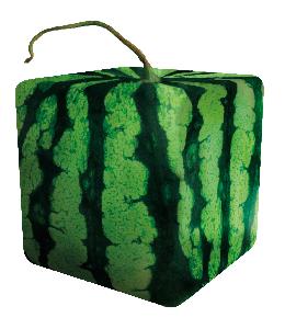
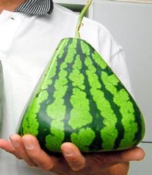
and this object could be in TFT icon of shishimaru


I vote for the square watermelon.
square watermelon! it's perfect
(btw: don't forget that the PearPC project logo is..exactly this:
http://www.weblogsinc.com/common/images/53...435318161586864
And now...

Don't be serious, just for fun
-------------------------------------------
Hi men. Yes your work is great. Thank you for your working at my projectWhen I'll be free I'll coding and publishing new version...
@BOBAH13 Your welcome
I'm going to send all images as soon as you want them.
By the way, as I said "Working for you is my honor. "
Thank you.
*I can't send a PM to you because your stored private messages quota has exceeded.
i have a problem with the app in Vista. Whenever i ran the app i had an error about libeay32.dll not being installed. Now i downloaded from other source and it says it doesnt have a "ASN1_const_check_infinite_end". Although i still get an error, i can hit "ok" and then the app runs, but it runs sooooo slow that i dont know if im missing something here.
I tryed reinstalling the app with no luck. Anybody can tell mw whats going on?
i have a problem with the app in Vista. Whenever i ran the app i had an error about libeay32.dll not being installed. Now i downloaded from other source and it says it doesnt have a "ASN1_const_check_infinite_end". Although i still get an error, i can hit "ok" and then the app runs, but it runs sooooo slow that i dont know if im missing something here.I tryed reinstalling the app with no luck. Anybody can tell mw whats going on?
As far as I know, XWindows Dock doesn't use libeay32.dll
Do you have XMail docklet installed? XMail docklet uses that library for sure.
As far as I know, XWindows Dock doesn't use libeay32.dllDo you have XMail docklet installed? XMail docklet uses that library for sure.
Yep, that's it. Church Punk, if you use XMail, make sure you installed it correctly (like on the thread, where you can download it, is described), if you don't use XMail, then remove XMail.dll from your Docklets-Library.
I Would like to Know what you think about my Dock icon and Png's ???
Have created a win ZIP file (it is Zip)
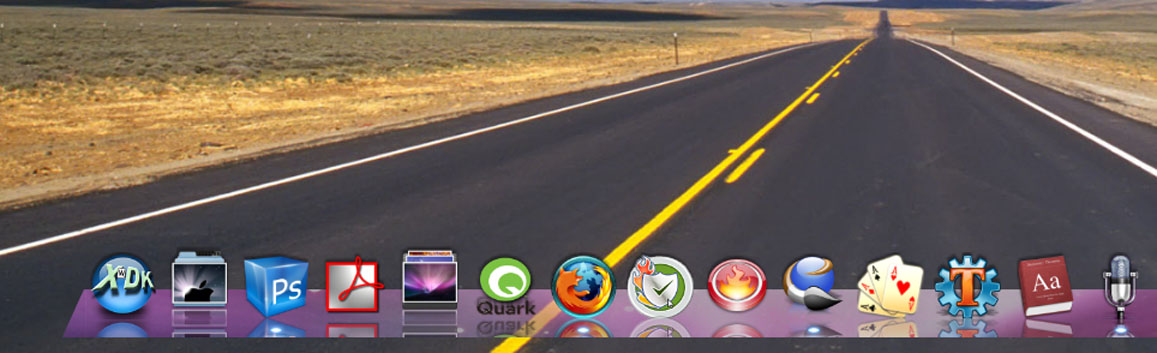
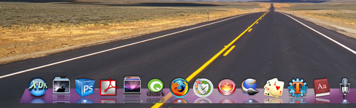
I Would like to Know what you think about my Dock icon and Png's ???Have created a win ZIP file (it is Zip)
not bad, but I don't like it. The radial gradient in the center looks odd (why would it logically be there?) the purple wouldn't fit on most desktops, The my computer icon doesn't have that much to do with my computer, and it looks a bit flat.
Feel free to make a better one though, don't give up, and realize this is only my opinion
btw, it looks like you stole some of those icons. Why would you make icons with reflection in them when xwd already renders reflections?
the skin is originally like the Leopard Sky background
but it's either the higher part of the background, or the lower part of the background
but yeah good one, but i do agree, it wouldn't fit in most desktop backgrounds...
the my computer png looks okay
so just keep doing what your doing, and just try to improve a bit, on what we mentioned, and i assure you everything will look good!
the my computer png kinda reminds me of microsoft word's word art for some reason (remember that? Ahah, I remember when I was in like grade 2 I thought that was really cool. Anyone else share my nostalgia?  )
)
the skin is originally like the Leopard Sky background
Ahh, now I see it.
okay im finally in the final processes of getting my dock to look perfect, or at least in my opinion.
Im currently wokring on a stack icon, because the given ones look pretty dull, im making a new shutdown icon, and maybe i might spoof up the adobe icons.
please tell me what you think of the dock in accordance with the background and everything.
Ill upload the icons as soon as im done, and ill post back soon.
(the bad quality ss is because i used paint instead of photoshop XD)

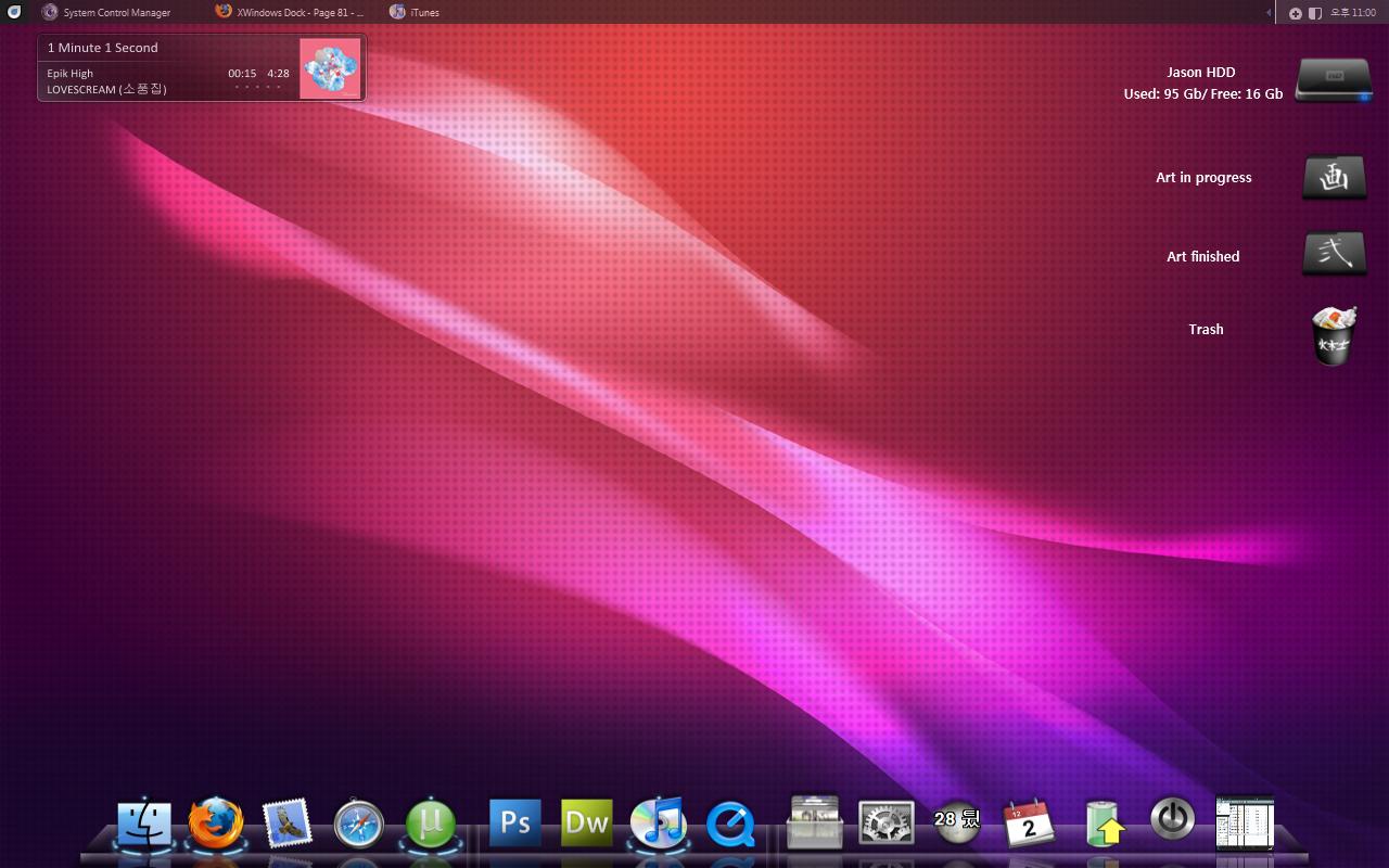
okay im finally in the final processes of getting my dock to look perfect, or at least in my opinion.Im currently wokring on a stack icon, because the given ones look pretty dull, im making a new shutdown icon, and maybe i might spoof up the adobe icons.
please tell me what you think of the dock in accordance with the background and everything.
Ill upload the icons as soon as im done, and ill post back soon.
(the bad quality ss is because i used paint instead of photoshop XD)
You asked for opinions : Wallpaper is making me dizzy! It looks nice, but these dots...no no. VS and your desktop-elements look great. The Dock: I personally don't like the BlackGlass, because the reflections looks wired and unnatural in this bulky glass, even if I love the indicators (but they overlap the edge, what makes the reflection even more wired). Your Icons don't go well together, and not only shutdown and adobe icons. They look inconsistent. Sorry, I'm a bit pedantic and just love to share my 50cent But hey, tastes are different and it's important that you like it
thanks guys, it is working now, i missed both of the dlls for xmail.
Now last question remains: Why is it so slow?
Using the last version with Vista 32
thanks guys, it is working now, i missed both of the dlls for xmail.Now last question remains: Why is it so slow?
Using the last version with Vista 32
What is slow? Animation? A Docklet? Startup? Show/Hide? Stacks?
Vista is too slow on really fast PC
@Crusar: wow...super...and I think it's much "original" to be a X Win Dock icon ....maybe the Default one...but it's to mettalic...maybe with another colours combination....
Let's see what the others say about it...