XWindows Dock v5.2.3

@shishimaru: have you tested your icons on different coloured backgrounds? Make sure they're clearly visible on any background (most icon themes achieve this by doing a double dark light border.) I'm mainly concerned about the folder icon. Everything else looks like it would work great.

Keep up the good work!

#516122

I can not add skins to the dock

I keep the skins in the folder "" SKINS "program

I use it when it does not appear on the dropbox

some help?

Restart the dock, or just go to the Panel tab in settings and press Update.

#516131

@shishimaru: have you tested your icons on different coloured backgrounds? Make sure they're clearly visible on any background (most icon themes achieve this by doing a double dark light border.) I'm mainly concerned about the folder icon. Everything else looks like it would work great.

Keep up the good work!

Thanks to the original creators of these skins and wallpapers with permission of the owners.

Screenshot-icons-docks.jpg

Thank you.

#516135

Dock skin on right image (wallpaper) looks awesome with light and dark wallpapers. So it will be finest default skin.

Next, imho:

1. Folder icon bottom line must be the same as thrash can (because now we have flying folder :) )

2. Control panel looks so massive in comparison with thrash can

3. Stack icon don't must looks like apple, it must be somthing like this:

Transparent_Stack_Icons_by_hotiron.jpg

#516144

Apple have not patented a square with a triangle in it.

#516148

Dock skin on right image (wallpaper) looks awesome with light and dark wallpapers. So it will be finest default skin.

Next, imho:

1. Folder icon bottom line must be the same as thrash can (because now we have flying folder :) )

2. Control panel looks so massive in comparison with thrash can

3. Stack icon don't must looks like apple, it must be somthing like this:

Oh! Thanks for your notice.

Screenshot-icon-position01.jpg

Screenshot-icon-position02.jpg

Which would you choose between bottom or center position?

Thank you.

#516152

center, because the reflection makes it obvious it's floating, and bottom looks silly in the stacks.

#516153

I think you're both forgetting a Finder/My Computer replacement, which almost everyone is going to have on their dock.

#516154

center

#516155

I think you're both forgetting a Finder/My Computer replacement, which almost everyone is going to have on their dock.

Sorry, The Finder Icon is in progress.

#516156

Oh! Thanks for your notice.

Which would you choose between bottom or center position?

Thank you.

Uh, this is so beautiful! I can't wait till it's finished :)

1. I like the first, original alloy-Dock by you the most, even if the Icons work with some of your alternative Docks, too.

2. Like Deavy said, make the Control-Panel Icon a (very) little bit smaller, to fit with the size of the Recycle Bin.

3. I like the centered Folder Icon better, then the one on the bottom. I don't care, if it's "flying" a little bit.

4. I would love to see some "boxes" as additional Stack-Icons (if they are more beautiful than Deavys samples ;)). But I would like to have the bigger Folder-Icon as an optional Stack-Icon, too! Perhaps you can just ship them with the theme, because everybody can change it easily.

Great work, i'm looking forward to your next steps... :D

PS:

Apple have not patented a square with a triangle in it.

No, they have not. But they have patented the way the dock works (see Y'z Dock). And because XWinDock can have the same problem as Y'z Dock, we are trying to cover the tracks, to make it less obvious that XWinDock could be seen as a copy of Mac Dock. And to achieve that, we want to use less MAC-like graphics as possible, even if these graphics itself are not patented. That's all. This strategy seems to work for ObjectDock and RocketDock, both are shipping very Mac-unlike default setups.

#516159

They hadn't patented it then, and has anybody seen any proof they killed Yz, or was the creator just tired of it?

If Apple wanted to shut down xwd, all they need to do is look through this thread.

I do, however, support the use of non-mac skins and icons, because it would be a shame to have this dock branded as "Some mac clone tool thing", rather than a dock that can stand up to all the other docks in it's own right.

#516162

2. Like Deavy said, make the Control-Panel Icon a (very) little bit smaller, to fit with the size of the Recycle

I fixed it. :)

Stacks v1.1

Fixed

- Re-designed

Screenshot-icon-stacks-01.jpg

All artwork images are the preview, not the final works.

Thank you.

#516163

Awesome looking, man :)

Do you have a dock to go with it, because that would be awesome :)

#516164

translation in Italian language version 6.0 for XWindowsDock version 5.2.1:

http://www.aqua-soft.org/board/showthread....ed=1#post516165

#516166

I fixed it. :)

Stacks v1.1

Fixed

- Re-designed

Screenshot-icon-stacks-01.jpg

All artwork images are the preview, not the final works.

Thank you.

your icons have become a tad more shiny than your dock. Perhaps add a little bit of glare to compensate? I'm not sure if it'll look bad though, just my thought ;)

#516177

your icons have become a tad more shiny than your dock. Perhaps add a little bit of glare to compensate? I'm not sure if it'll look bad though, just my thought ;)

aonde eu baixo estes icones?

#516178

Estes icones vão vir nas novas skins?????? EU quero baixa-los

#516179

your icons have become a tad more shiny than your dock. Perhaps add a little bit of glare to compensate? I'm not sure if it'll look bad though, just my thought ;)

I tested it but didn't work for me even I set opacity at a lower level.

I thought it's ok because of reflective effects.

Maybe I'll remove shiny effects at Stack icons.

Thank for your suggestions :)

#516181

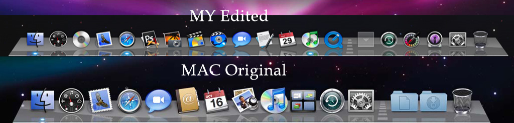
Thanks all guys on this forum!!! Almost one year I used Rk launcher an today found this awesome program!!! Thanks a lot to developer for that!!! One thing which i didn't like it's default Leopard dock skin - it different from leopard. As if i

owner of Macbook I know how it can be... And I reedited some pngs files added shadows, changed corners of dock and also changed indicators with separator.

You can install it just remove original then apply and save theme :) Enjoy

P.S. It's not 100% of original Mac Dock but almost 99,9 :)

post-91642-1227919193_thumb.jpg

Skin.zip

LeooS.jpg
LeooS.jpg

Attachment: Skin.zip

#516183

Lol im checking this thread everyday to see when the websites comes out and when animations are gonna be improved. And hope matonga and BOBAH13 team up for the animations part.

Can't wait for the good news !

Thanks

#516186

im sorry if this has already been posted, but there just are too many pages to go through so here's my question: is the following dock skin available for xwindows dock?

prev_float.jpg

this is for another dock, but i was wondering if it was available for this dock

page: http://macthemes2.net/forum/viewtopic.php?id=16784360

#516188

Sure man i´m the same situation!!!! My app of dreams is: XWINDOWS DOCK + MATONGA STACK DOCKLET + BOBAH13.

Damn i´ll be in the clouds.

matonga and BOBAH13 team up for the animations part. Jesus it´s just the best team up for this app

Of course we can´t forget to congrat the developer case without him i could´t use this incredible app. Once more man thank you a lot!!!!

#516189

I tested it but didn't work for me even I set opacity at a lower level.

I thought it's ok because of reflective effects.

Maybe I'll remove shiny effects at Stack icons.

Thank for your suggestions :)

Nah, I like the shiny effects like they are! I don't think it's a problem, that the dock looks less shiny, because it has the reflection! But tastes are different, so just my 50cent: don't remove the shiny effects from Stack icons and don't add shiny effects to the Dock :)

#516203

im sorry if this has already been posted, but there just are too many pages to go through so here's my question: is the following dock skin available for xwindows dock?

this is for another dock, but i was wondering if it was available for this dock

page: http://macthemes2.net/forum/viewtopic.php?id=16784360

Yeah, two off them: Float Ocean and Float Rainbow, but they look a little bit different then your picture. They are in the last Theme-Update-Pack for 5.2.1., but I don't want to search this thread for them, too :P So I just packed them together and attached them here, but they are not created/ported by me!

Float Ocean.zip

Attachment: Float Ocean.zip

#516204