 Aqua-Soft Forums
[request]vlc Media Player Skin


the white one looks both cool and original to me! 
But I like to have the close, min and max buttons on the right side >.<
i suggest u ask aquagrl to port it or something
as far as skinning is concerned she is as good as anybody out there
:cry: Aquagrl.. pls.. port it to somthing...
i support the brushed one 
yes, the brushed one, dammit! :rule:
How do the pressed button states look like?
do yur stuff mate!
Well..?? nobody's interested to port this to somthi' n like winamp, windows media , ect.. 
VLC is the greatest media player in existance. The reason more people don't use it is because it is so incredibly ugly. A skin like this would make a world of difference.
I've been meaning to make a skin for it at some point. (I would probably make a generic/attractive skin, or a System 6 skin, but I would leave this skin up to someone with more OS X style skinning experience)
I might try to make a port, but I need some resources. I took all the fields and buttons from the VLC dev site, but I need a quality PNG of the brushed window and some playlist screenshots (different button states etc.).
And you, mac guys, could port all the VLC icons (filetypes and stuff) in the meantime =) Cuz I failed to download them from the site...
EDIT: send screenies to m.fedoseev at mail.ru, or mfedoseev at mac.com
Some Buttons to give you.

Very well (Y)

I know early, but I don‘t like it。
I prefer the milk one instead.. the first tobe ported.
b0r3d, you're in luck. Actually, been meaning to post back, but the board wasn't working then.
After my initial post here, I set out to make the milk version, but w/ no resources available to me, I thought I'd give it a self-try.
So, I made some "original" graphics based on the screenshot provided in the first post. For the most part, the look is there, but the details aren't quite exact.
Tell me, if you like it as shown, or should I try to improve it. I stopped w/ the coding as I hit a bit of a snag (something I'm trying to do is not working, don't know if it's possible). Also, I wish VLC had functions for all those buttons.
BTW, which would you prefer: same graphics in buttons or suited for function (open log or w/e)?
edit: I also guessed at how the hover/clicked buttons looked, so it's probably not accurate already.
I also added a mute button on the left speaker icon near the volume bar. Is it better to put it on the right one and toggle b/n wave/no-wave? Right now, I have the left speaker icon w/ an X on it if muted.
And yes, I will release a right-hand min_max_close button version (btw, I have close=quit, max=fullscreen, & min=toggleOnTop).
edit2: The snag I've hit in the coding part is that there isn't an easy way to have a mouseover image without changing controls. The current workaround is to replace the original control with a control whose up image is the mouseover image you want.
This is fine for single function controls. I even found a way to do it for a 2 function control; namely the onTop toggle for the min button (w/o mouseover image this is easily accomplished w/ the CheckBoxControl).
I'm trying to make it so that the Play button can toggle function b/n play and pause and to show the corresponding buttons accordingly. That means 2 hover images in total. That wouldn't be a problem if the Play function only played. It doesn't, as it also opens the file dialog.
I'm thinking of workarounds w/ multiple states as w/ the 2 function control, but I think the file dialog problem is unsolvable as a cancel to the dialog can't be assigned with more functions.
Unless there's a viable solution, I'll go w/ separate buttons for those two functions.

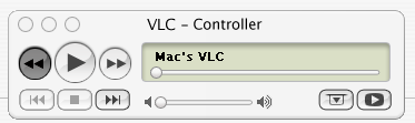
Originally posted by Panther@Jan 23 2004, 09:44 AMI know early, but I don‘t like it。
Panther, why do you not like that one Tadis suggested? I put that one together w/ the images from liquidbrain's BSPlayer skin (thanks again liquidbrain  )
)
Is there something wrong w/ it aside from aesthetics?
Originally posted by mimeryme@Jan 24 2004, 09:11 AMb0r3d, you're in luck. Actually, been meaning to post back, but the board wasn't working then.
After my initial post here, I set out to make the milk version, but w/ no resources available to me, I thought I'd give it a self-try.
So, I made some "original" graphics based on the screenshot provided in the first post. For the most part, the look is there, but the details aren't quite exact.
Tell me, if you like it as shown, or should I try to improve it. I stopped w/ the coding as I hit a bit of a snag (something I'm trying to do is not working, don't know if it's possible). Also, I wish VLC had functions for all those buttons.
BTW, which would you prefer: same graphics in buttons or suited for function (open log or w/e)?
edit: I also guessed at how the hover/clicked buttons looked, so it's probably not accurate already.
I also added a mute button on the left speaker icon near the volume bar. Is it better to put it on the right one and toggle b/n wave/no-wave? Right now, I have the left speaker icon w/ an X on it if muted.
And yes, I will release a right-hand min_max_close button version (btw, I have close=quit, max=fullscreen, & min=toggleOnTop).
edit2: The snag I've hit in the coding part is that there isn't an easy way to have a mouseover image without changing controls. The current workaround is to replace the original control with a control whose up image is the mouseover image you want.
This is fine for single function controls. I even found a way to do it for a 2 function control; namely the onTop toggle for the min button (w/o mouseover image this is easily accomplished w/ the CheckBoxControl).
I'm trying to make it so that the Play button can toggle function b/n play and pause and to show the corresponding buttons accordingly. That means 2 hover images in total. That wouldn't be a problem if the Play function only played. It doesn't, as it also opens the file dialog.
I'm thinking of workarounds w/ multiple states as w/ the 2 function control, but I think the file dialog problem is unsolvable as a cancel to the dialog can't be assigned with more functions.
Unless there's a viable solution, I'll go w/ separate buttons for those two functions.
I Think the pressed buttons look the same as iTunes, nice theme I like the white one the most too
Huzzah! I've figured out a viable solution after all. Well, at least AFAIC. I think it's even more elegant than the solution for the other problem. Let's see if it'll work on that. (edit: natch! It didn't, but I don't care. )
Thanks for the comment XP_2003. Re: buttons, so even for the Milk theme the button effects are like the brushed counterpart? Blue for depressed buttons?
I'd still like to see others comment on the likeness/faithfulness of the screenshot I showed. I know that it's not perfect and it would take more work to attempt "perfection," even though I'm content w/ how it looks.
edit2: Btw, who do I ask permission from? Is it from vlc? If so, do I even need to make this skin? I mean, wouldn't the vlc for mac have compatible skin files? Or are the widgets drawn via the OS?
Max Rudberg designed those VLC windows (both). I think you should ask him.
I think your's looks good though I don't really think it (the original) has mouseover images seeing as itunes doesn't.
Thanks for the info smoke.
Do people want mouseover images? Hmm, I've already made them, but we'll see. Hopefully, I'll work more on it tonight. Haven't started the brushed version at all though (of course, the code will be done already).