Aqua-Soft Forums
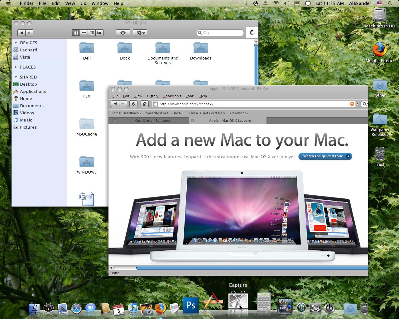
So I thought to give it a try... maybe it's like it should look.
The only thing I really need to change are the fonts, I know, but that takes a little time and time is precious while watching the grass grow 


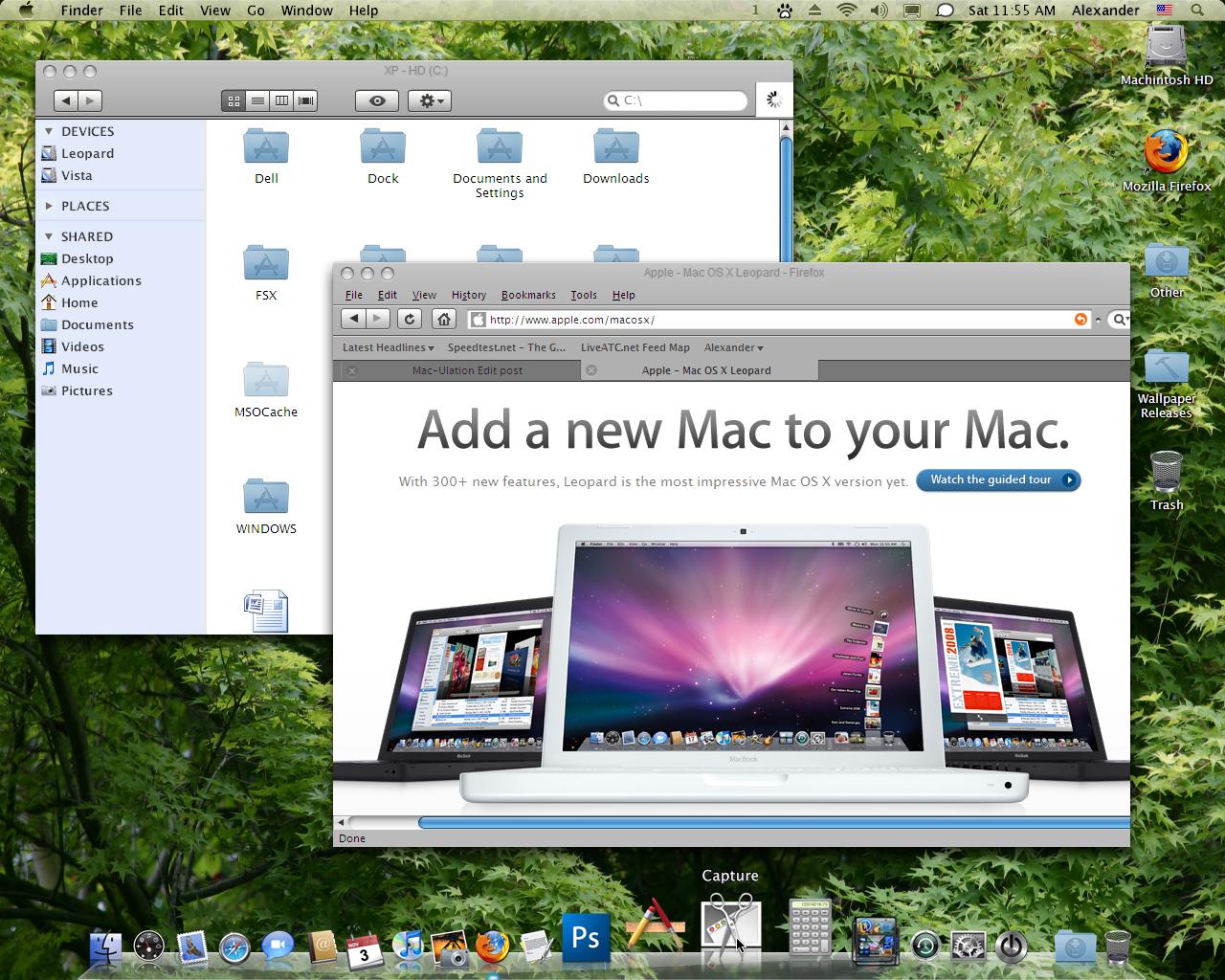
So I thought to give it a try... maybe it's like it should look.
The only thing I really need to change are the fonts, I know, but that takes a little time and time is precious while watching the grass grow
Look at my Leopard desktop 
I'm trying to Leopardize my computer at work. I've been somewhat lazily emulating OS X for years...with Y'z Dock, now RK Launcher, icons, and a different visual styles, but now I'm trying to match the desktop on my new laptop shown...
Not sure if I'll ever get it looking this good.
(On a side note...I don't actually use that wallpaper, although it's nice. I just applied it for comparison purposes.)
Can I ask how you guys get the black Mac icons on the right side (left from date/time) of the taskbar? =S
Could you point it,please
@Nahantra... could you link to that wallpaper... thanks.
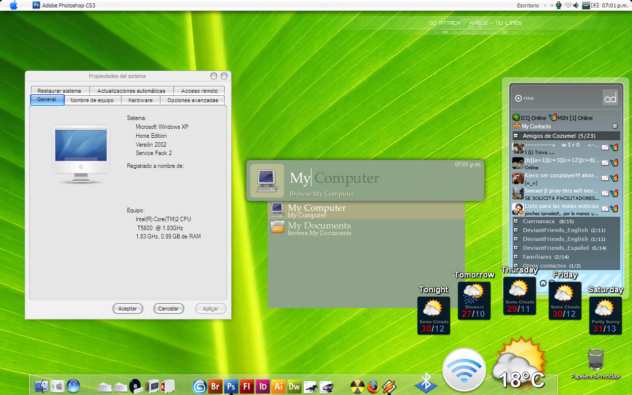
My Leopard emulation... It has the spaces icon in the menubar and the new speaker icon, the new font in the menubar and the new spotlight.


@Husaini HB: Those black icons I've pointed out in the attached image (the screenshot of diemuse's desktop). I would like to know how you get those icons.
@diemuse: Great emulation man! Never knew it was possible to have Spotlight on Windows XP, which program creates that?


@iRaptor: The Spotlight is made with the freeware MacSearch, and i modified the ´pressed´-state with a picture, taken from one of my Macs with Leopard.
The icons (TigerLaunch, Spaces, AirPort etc. ) are also taken from my original Leopard. I´m using TClock so nearly the whole menubar is a giant ´startbutton´ with complete windows-functionality, that´s important for me. TClock uses a .bmp as a startbutton, so I modified a picture of my original menubar (from one of my Macs), that it can used by TClock as a startbutton.
RKlauncher is modified by me, that it fits the authentic look of Leopard.
Hope that it´s helpful, sorry, for the only ´conversational´ English, I´m from Germany.
//Future posters, if you're going to post screenshots, please post them in the November Screenshots thread and provide a link to them in this thread. Conversation and discussion is welcome, but we don't want two screenshot threads.
-NC
@diemuse: Thanks a lot man! You really helped me out. ^^ And don't worry neighbour (I'm from Holland  ), I could read it without a problem.
Mine's looking much better! Check it out in this other thread I made.
Always glad to comply with your directions, NC .
(//Post Edited...entirely replaced, actually  . -NC)
Tryand please check this out :http://husainihb.deviantart.com/gallery/
Dude, how did you get the reflections of the icons on the dock to stay so close to the bottom of the screen?
On my dock (and many others) the reflections come high off the bottom, and you can see the icon's reflection end, which is kind of weak....
Here's what I mean (be patient for my picture to load, it's on a free file server so it's not the best):
I think its fair to say the "perfect" Leopard emulation is a very subjective thing. I see some members getting very hot under the collar about this detail or that widget, but lets be honest even with the most accurate emulation, the minute you open an app, the illusion is lost.
Just using the dock is a dead give away because the 'reflection' doesn't work properly and I am not even looking specific points like skins, layouts or fonts.
The intoxicating thing about emulation is that it's fun and if all we do is enjoy ourselves with the challenge, then that's rewarding enough..
Great posts one and all ...!

OS X Leopard vs XP Leopard
I use both Mac and PC.
Herewith back-to-back comparisons: Leopard OS X running on a G5 and Leopard XP running on a VAIO
Hello,Raats,I love your SC,especially the first one,was wondering what WB themes you use ?,how could you make the arrow scroll thumb stick together on the bottom like Mac OS X,what I know is only FF and TB (thunderbird) skin could do but not with WB theme,would you released it or share with us,thank's
Edit : oops,didn't read your last paragraph
@RaatsWhat are you using for your iCal clone?
Rainlender.
Its a skin I made for the later version of Rainy but its NFR simply because it has a ton of bugs still - and I don't have the time to fix it.
I use it simply for general entry's and nothing more (I use the real iCal on my Mac normally).
Well, you tell me xD
(all is functional, nothing in the picture is editing or anything)

Looks good, but looks nothing like leopard...
Really proud of my firefox, the bookmark font is the only thing annoying me though..
@diemuse: your spaces icon isn't the newest one... I currently am running Leopard so this is the real icon (attached). I put this in .png format but on windows you can convert it... I just can't upload a .ico on Aqua-Soft.org
[[EDIT]]: Tell me if you need any other icons...
Dude, how did you get the reflections of the icons on the dock to stay so close to the bottom of the screen?On my dock (and many others) the reflections come high off the bottom, and you can see the icon's reflection end, which is kind of weak....
Here's what I mean (be patient for my picture to load, it's on a free file server so it's not the best):
If you use Rocket dock,open dock setting--->Position--->Edge Offset +/- slide to -3pix