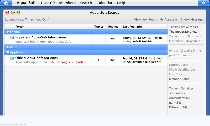
Status Update July 18th

Originally posted by Cerebral@Jul 19 2004, 09:13 AM

'Couple of suggestions for the top bar (which is pretty cool):  When you click a link in the drop-down menu, having it disappear immediately would be a nice effect (even though it navigates to another page pretty quickly after)

As well, having the dots beside "Log Out..." implies that you're going to get some sort of option when you click it (Such as "Are you sure you want to log out? Y/N").  Might be clearer just to say "Log Out", then there's no ambiguity.  You click this link, you're logging out right away, so THERE! :P

Regardless, I like the direction the forum is going, keep it up!

<{POST_SNAPBACK}>

Hmmm, I can not get these OSX 'drop-down menus' on the A-S logo on the new titlebar nor does the Search (mag glass) feature work on my Firefox 20040716 Branch/Aviary nightly...:(

But it all works/displays correctly in IE6...dam trials/tribulations on this wonderfully promising 'alpha/beta browser'...

#191787

Originally posted by babypapichulo@Jul 20 2004, 07:07 AM

MyibPortal, take a look at it Timan!

<{POST_SNAPBACK}>

I somehow think that would be quite useless as it is based on IPB 1.2.

#191849

The top bar is a great usability achievement.

I wonder if it would be possible to put it inside a borderless frame so that it always remains at the top.

Getting rid of the remnant headers by moving them entirely into the top bar seems a good idea to me, too. (In topic view every line from "Aqua-Soft Board Guidelines..." to "... My Assistant 0 New Messages", to get rid of duplicates and move the uniques into the bar, perhaps as submenus)

This would streamline the user interface so far that a standalone Aqua-Soft browser application without any IE toolbars and menus could be usable.

Just my $0.02

#191988

Originally posted by herd@Jul 20 2004, 06:54 AM

...

Getting rid of the remnant headers by moving them entirely into the top bar seems a good idea to me, too. (In topic view every line from "Aqua-Soft Board Guidelines..." to "... My Assistant 0 New Messages", to get rid of duplicates and move the uniques into the bar, perhaps as submenus)

...

<{POST_SNAPBACK}>

check out therealduckie.net and see if it feels any better without the normal shortcuts on the page. I put them all in the bar.

#191989

Originally posted by Duckie@Jul 20 2004, 12:57 PM

check out therealduckie.net and see if it feels any better without the normal shortcuts on the page.  I put them all in the bar.

<{POST_SNAPBACK}>

Yeah, it really feels better and everything is where expected.

One glitch is that you can click on more than one menu item and all

of them remain open - perhaps there is something like OnLostFocus() in the

section? I see a OnFocus() handler there...

#192083

Originally posted by herd@Jul 20 2004, 11:53 AM

Yeah, it really feels better and everything is where expected.

One glitch is that you can click on more than one menu item and all

of them remain open - perhaps there is something like OnLostFocus() in the

section? I see a OnFocus() handler there...

<{POST_SNAPBACK}>

Yeah, it's something I am looking in to. I already added the code for the menu to hide immediately upon a click, so that was next on the list but after spending a whole 5 days on that redesign, upgrading the gallery and a few other tiems I havent yet released, I need to take a break from it

#192085

Hell with it, here is the basic layout idea for the new skin. Nothing is final and it’s just a basic idea. We need some help on finish this design up so we can get to skinning the boards.

If you guys have ANY! Ideas in terms on skinning the right column (board stats), forum index (where the topics are listed) and the post bit (what you see now) please let us know.

It’s not easy to come up with designs as it used to be.

1.gif

#192086

No ideas? Come on... :blink:

#192135

Originally posted by Timan@Jul 20 2004, 01:21 PM

No ideas? Come on...  :blink:

<{POST_SNAPBACK}>

Sorry, I'm not amazing when it comes to creativity. I really like having the board stats on the right though, so that you don't have to scroll down to the bottom to check them anymore.. it makes the birthdays more prominent too. Looks clean 'n pro.

@Duckie: Is that how results look when you're searching on a Mac?

#192144

i dont think i like the names on the side. it looks kinda clutterd, and messy. how about a drop down list or a tab or something.

#192179

Originally posted by Cerebral@Jul 20 2004, 01:52 PM

@Duckie: Is that how results look when you're searching on a Mac?

<{POST_SNAPBACK}>

That's Spotlight from Tiger.

#192190

How about all the stuff at the bottom that always gets overlooked?

Might neaten the place up a bit...

post-8531-1090357862_thumb.png

asidea.gif
asidea.gif

#192209

Originally posted by DoubleD@Jul 20 2004, 05:11 PM

How about all the stuff at the bottom that always gets overlooked?

<{POST_SNAPBACK}>

*barney gumble voice* I like it!

Seriously tho, that looks good... then the full list of people online could be still at the bottom perhaps... or in one of those fancy pop-up DIVS like you use for the menus at the top?

#192210

If I had the time I would make a mockup of ideas maybe tomorrow but just a thought... how about the search criteria buttons on the right?

searchkinds_20040628.gif

If its possible I think it would be wise to have these things collapsable especially the member list if its going to be active in the pane as with it being vertical at busy periods that could stretch quite long... looking at the member list now you would probably be talking over 10 lines

#192256

Unless you can make it so that they stay permanently hidden, please don't add the active members and board stats stuff on the right. It'll be too cluttered.

#192348