 Aqua-Soft Forums
[release] Adobe Cs Pack


shoulnt this be a preview?
wonder who's going to get at this first, Seph or Wizard lol
RELEASED
sorry for not putting it in the released section. Made a mistake and I've got a throbbing headache
Nice set, although I prefer the simpler default icons from OSX. I'm sure many will be pleased by this. Now I just need to finish getting the Creative Suite.
BTW, this should be in the Release section.
Seph isn't awake during these hours. I could have left it for Flarex though. My bad.
As I said in the News post, these icons are beautiful. Thanks for your contributions.
<_< I prefer the default icons better, i snagged an almost exact copy over at Wincustomize.com and really its just without the black border around it... Not very creative and not very good by just adding a CS...::thumbs going down as far as they can go:: I'd like to see something better, anybody agree?
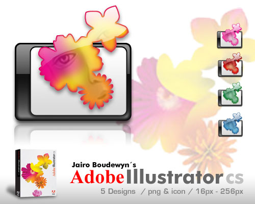
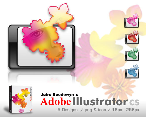
These icons look better for the suite if you like the milk look. Also, :6 for disrespecting their creativity and disrespecting them.
i think that is a good work ! 
i have do the same amnesia (icons based on screenshots of adobe.com site)
but i want to ask if there some others sources of pics or probably original mac icons @128 or more pixels !
so poeple who have this please share it, thanks 
what the hell are you accusing me of?
First of all, jairo makes his own icons and is part of Oxygen-X, I would never rip from a person.
Everybody has there own opinions and saying what you've said was more of a diss than a opinion.
Dont forget that I dont have to do what I do, but I enjoy it, and I like to provide something for the community that has given ME so much.
If they are similar, thats because THEY ARE THE LOGOS. What am I supposed to do? Change the logo just so its not similar? :S Plus looking at Jairo's you can see that the white part is not shaded as mine and the feather for example does not have the same texture and mine doesn't have the eye in the middle. (alot of differences!)
I have the complete PSD's if you would like to see my work.
I am now really pissed off at this. Bloody hell, you can read the forums more often and get updated on info before going around spewing waste.
Thanks for those who like them and support me.
And of course if you want to see any changes let me know. Or if you dont like something in specific let me know as well, I'm a nice person as you all know  I like to know just not be dissed out in the process.
Donzee I got those high res images from adobe.com flash animation. I did a print screen and then I used the border magnet tool to make the shape of the lead or flower etc.. then I made a new image pasted the shape and filled it with a white color. I then used the gradient tool and tried to match the colors and also copied some texture from the original image. Hope that helps
Calm down amnesia, you don't need to stoop to their level of ignorance.
Originally posted by Tylrmdetb2@Nov 21 2003, 08:36 AM<_< I prefer the default icons better, i snagged an almost exact copy over at Wincustomize.com and really its just without the black border around it... Not very creative and not very good by just adding a CS...::thumbs going down as far as they can go:: I'd like to see something better, anybody agree?
I you don't have something to contribute to this community, please keep quiet when some make a huge contribution like amnesia. Just shut your mouth a enjoy the nice release. Can you release something better thann this??
If amnesia ripped jairoB icons, you are not the first one will notice it. Me, wizard,
and jairoB will be the first one to notice it compared to you that only be around for just a few days.
Anyhow no offend though.....
You can critique but not in order to demotivate other persons work....
to amnesia, calm down and keep up your good work. We all knows your ability and talent
Tis good to be honest... Don't take it personally, its just his opinion. :canadian:
These icons are not even close to being a rip. They are also not like the original icons. Have you even seen them? Your ignorance in acknowledging someone else's work is amazing.
Originally posted by amnesia@Nov 21 2003, 03:14 AMwhat the hell are you accusing me of?
First of all, jairo makes his own icons and is part of Oxygen-X, I would never rip from a person.
Everybody has there own opinions and saying what you've said was more of a diss than a opinion.
Dont forget that I dont have to do what I do, but I enjoy it, and I like to provide something for the community that has given ME so much.
If they are similar, thats because THEY ARE THE LOGOS. What am I supposed to do? Change the logo just so its not similar? :S Plus looking at Jairo's you can see that the white part is not shaded as mine and the feather for example does not have the same texture and mine doesn't have the eye in the middle. (alot of differences!)
I have the complete PSD's if you would like to see my work.
I am now really pissed off at this. Bloody hell, you can read the forums more often and get updated on info before going around spewing waste.
Thanks for those who like them and support me.
And of course if you want to see any changes let me know. Or if you dont like something in specific let me know as well, I'm a nice person as you all know
Donzee I got those high res images from adobe.com flash animation. I did a print screen and then I used the border magnet tool to make the shape of the lead or flower etc.. then I made a new image pasted the shape and filled it with a white color. I then used the gradient tool and tried to match the colors and also copied some texture from the original image. Hope that helps
well i don't accuse u i just said that these icons r captures from adobe.com web site and this is somes :


so don't let me b missunderstood amnesia
i ask for a complete pics like in original icons and there is a difference :


i hope that is clear
PS : i'm nice person too :smartass:
oh no donzee I didn't mean you!
I meant Tylr.
(btw some people IMed me since there are so many images. Do you mind making them links rather than just placing the image? since many have 56k modems and it makes the page load slow)
Thanks alot
...So if u have made them from flash ( vectorize) or capture i don't think that there is a difference for a result at 128 or 256 pix! no?
but ur work may be usefull for large posters ! :smartass:
sorry maybe you misunderstood, I didn't make the flash animation, the flash animation is ON the site.
If you extract the swf and then open it using the browser you can get the images as large as you want.
well
oof !
i don't like to be misunderstood !
for flash i talk about extractin shape from swf flash file and import it in photoshop (ai) but don't worry !
freinds ?
Nice Icons, thanks for making them.
No one mentioned the gloss link file name is misspelled you spelled it cssgloss, should be csgloss.
http://www.oxygen-inc.com/iconpacks/csgloss.zip (not cssgloss.zip)
Nice icons! I prefer the first set (not very much into glossy icons).
How about dropping the "CS" and adding the app name to each icon? ... a bit greyish maybe? Thank you! 
LOL, misstyped my own link.
Hope WIZARD SEES THIS!
I'll create an edit of the first set for you Ken
I saw it, I saw it. Fixed.
Who knew it'd cause such offense to someone. The intention wasn't to be mean or to get you "pissed off." Its really just an opinion that really should be under consideration. I would have liked to see more creativity. Here's some good suggestions:
- Try not to build an image as an icon and try to fit the CS wherever it fits, its poor design.
- I feel you would have a more solid set without the CS, or make it smaller
- Your icons are similar's to that wincustomize link earlier with outlining the shape of the feather for photoshop and so on
- It would have been stronger to use the actual illustrator flower for your icon
- Might have been better to put the images such as the feather all in the same spot to unify the group
- If these are a glass set, possibly more of a glass look. There's a tutorial if you don't know how on this page.
Some examples.....
I didn't mean to piss anyone off and it seems a bit much to get pissed because you can't take constructive criticism. I'm sorry if your offended dude, totally not the intention. I just hope to see a better set for a site full of people that deserve it. If you want me to make some let me know so you can see what i mean, i'm sure i could squeeze in some time. Just cause i'm new to the site, doesn't mean i'm new to making things look professional. (Y)