Aqua-Soft Forums
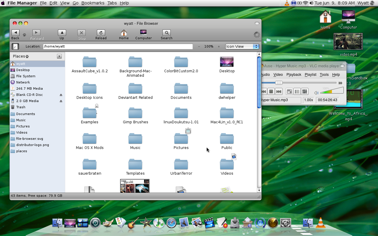
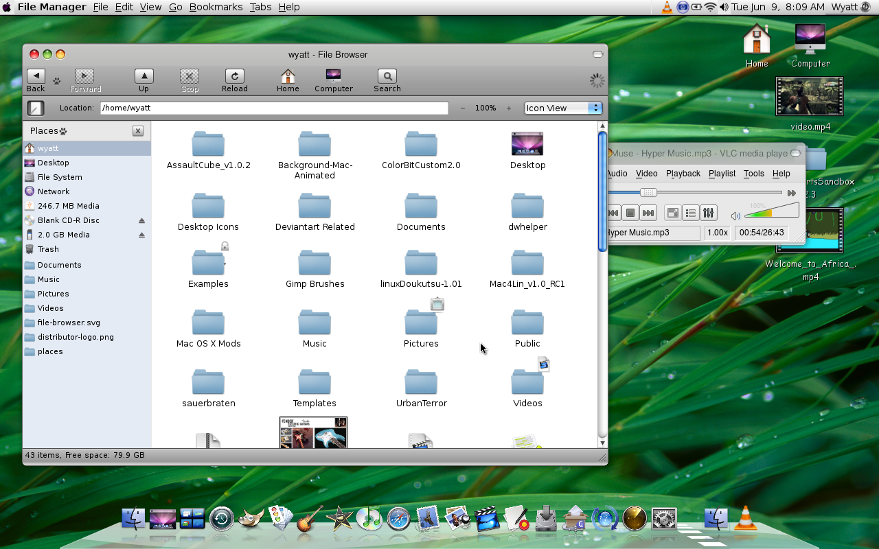
This is my Ubuntu 8.10 desktop made to look like OS X Leopard 10.5. What do you think needs to be fixed about it?
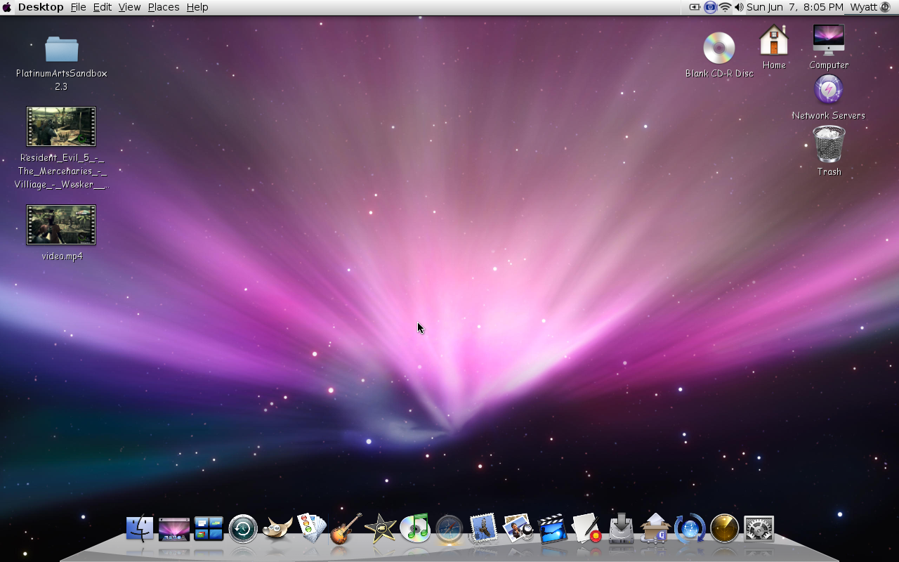

This is my Ubuntu 8.10 desktop made to look like OS X Leopard 10.5. What do you think needs to be fixed about it?
Im not very familiar with Ubuntu, but if you want a more Mac-ish feeling, just change the Comic-Sans font to Lucida Grande & Try to hide the trash icon.
As above comment, change your fonts.
Align desktop icons to right: drag all icons to right side, right-click on desktop> select "Align icosn"...
reduce side angle of dock to maybe 36 degrees, and lower your icons...
Use Global Menu for top bar
I think that's looking pretty good. I'm with everybody else, Comic Sans is the most horrible font ever and I wish people wouldn't use it. Its ugly and overused.
As for everything else, it's looking pretty darn close. Only hard disk icons and on the desktop by default (I don't know of a way to remove them, actually) and there is no home icons, etc. As a mac user I only have drive icons and occasionally folders for something I'm doing at that very moment for easy access (So something I'll either delete or move once I'm done).
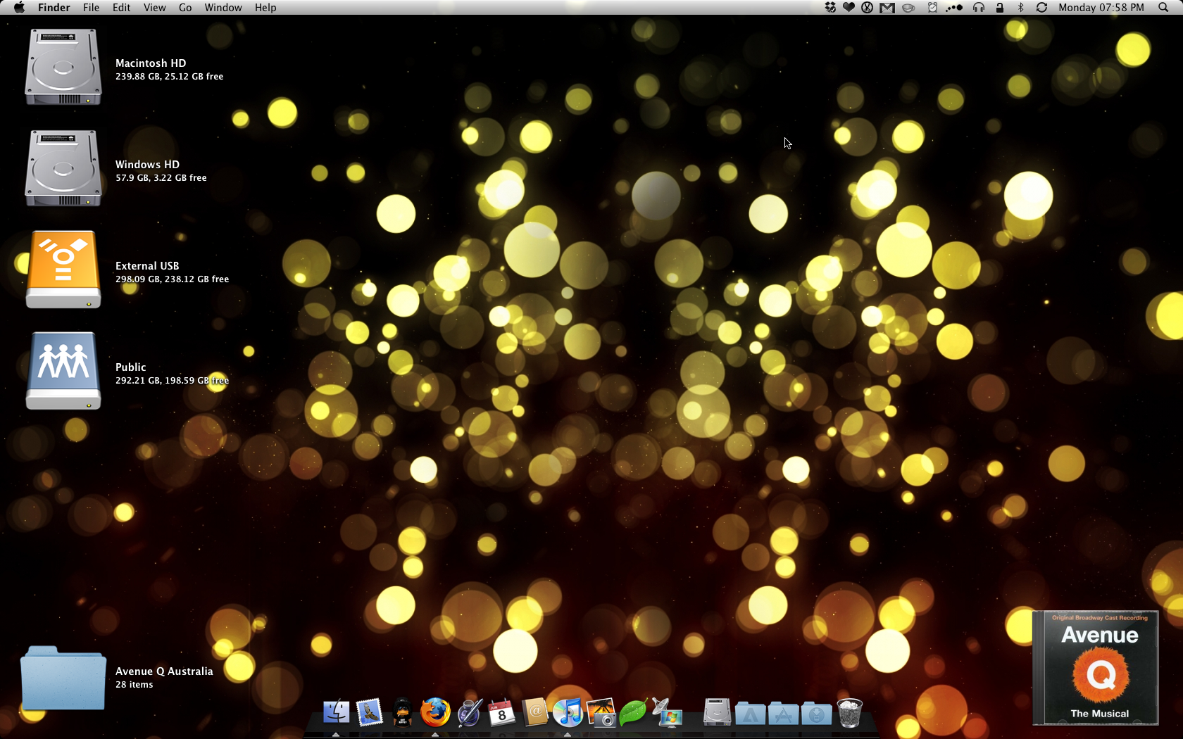
The dock's slant is not at 45˚ as yours appears to be. It's a much gentler angler and the icons are a lot closer to the bottom of the screen. I've attached a screenshot of my desktop (which in terms of menu bar, dock, etc. is default... kind of)
Things you should do to make it closer:
- Fix the dock (icons down, get the slant angle closer)
- If you can, try some different font smoothing.
- Fix all those problems with graphics in the menu bar (eg. apple button, power icon, etc.) Leopard menu icons are usually black and white only (refer to mine)
- Get rid of everything on your desktop except drives.... if you want.
- You don't *have* to use the default wallpaper =) But if it makes you feel more like you're using a mac go right ahead.
Here's my desktop for reference.
Happy theming =)
Thanks guys!
This is "pretty close" in your eyes? This looks absolutely terrible.
I'm sorry, but did you feel a need to create a new thread just to show off your ugly screenshot? There's a desktop thread for that.
May I suggest you publish a screenshot on each detail you enhance on your customization, maybe with some detailed description of the steps you followed? 
As to now it looks as bad as any Windows Mac-emulation pack, but luckily enough you're working with an open source platform having plenty of possibilities because of that.
I mean, I really encourage you carry on. Wuzzie's screenshot is pretty much what I see when I work in my mac (except for the dock which is not Leopard's default one).
Sorry, I didn't know there was a desktop screenshot section. You may notice that i'm new.
Mind showing us a few windows open?
Sure, but it might not be until tonight.
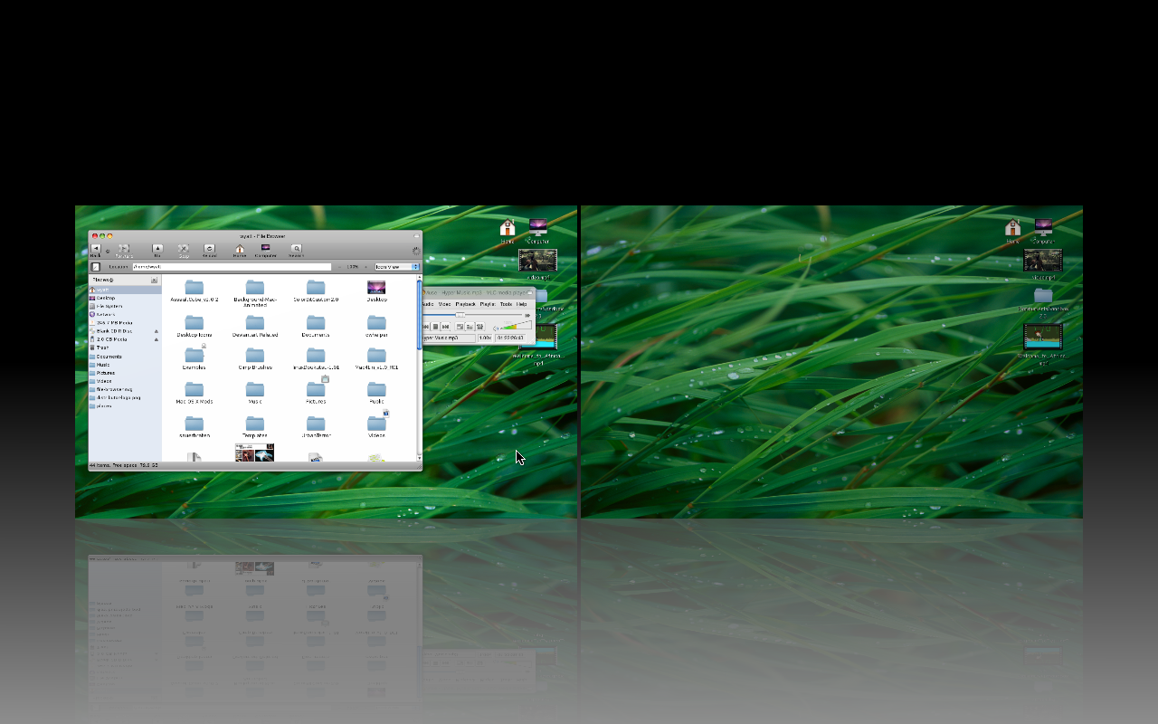
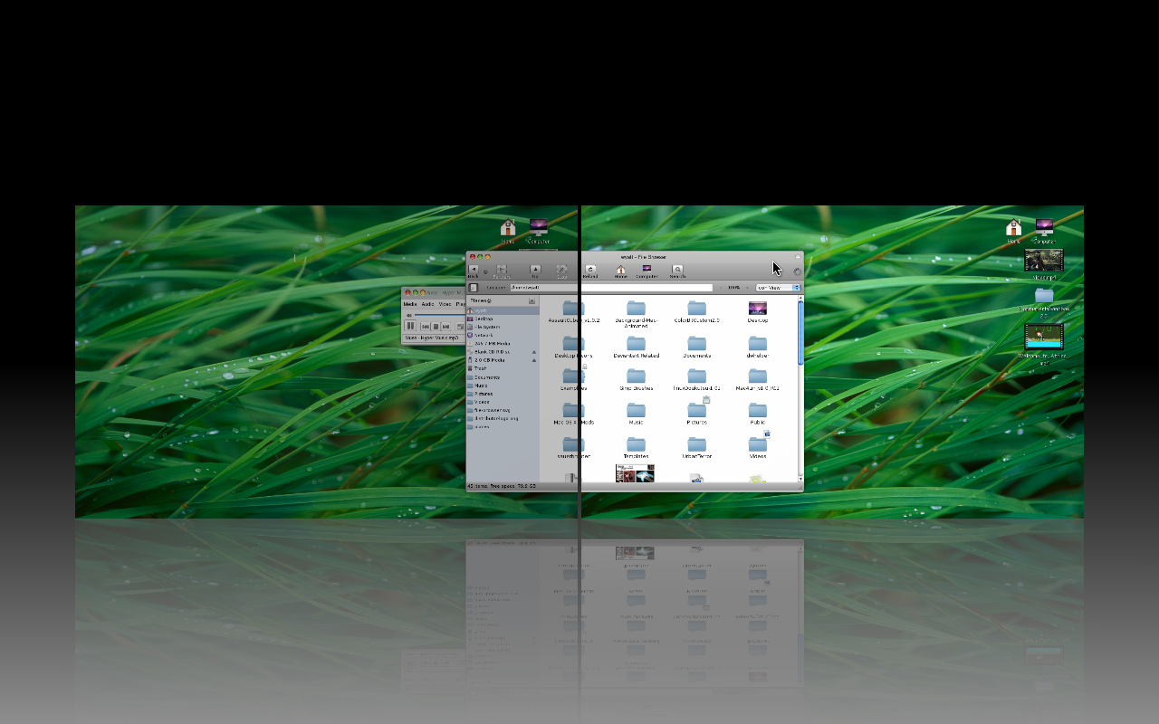
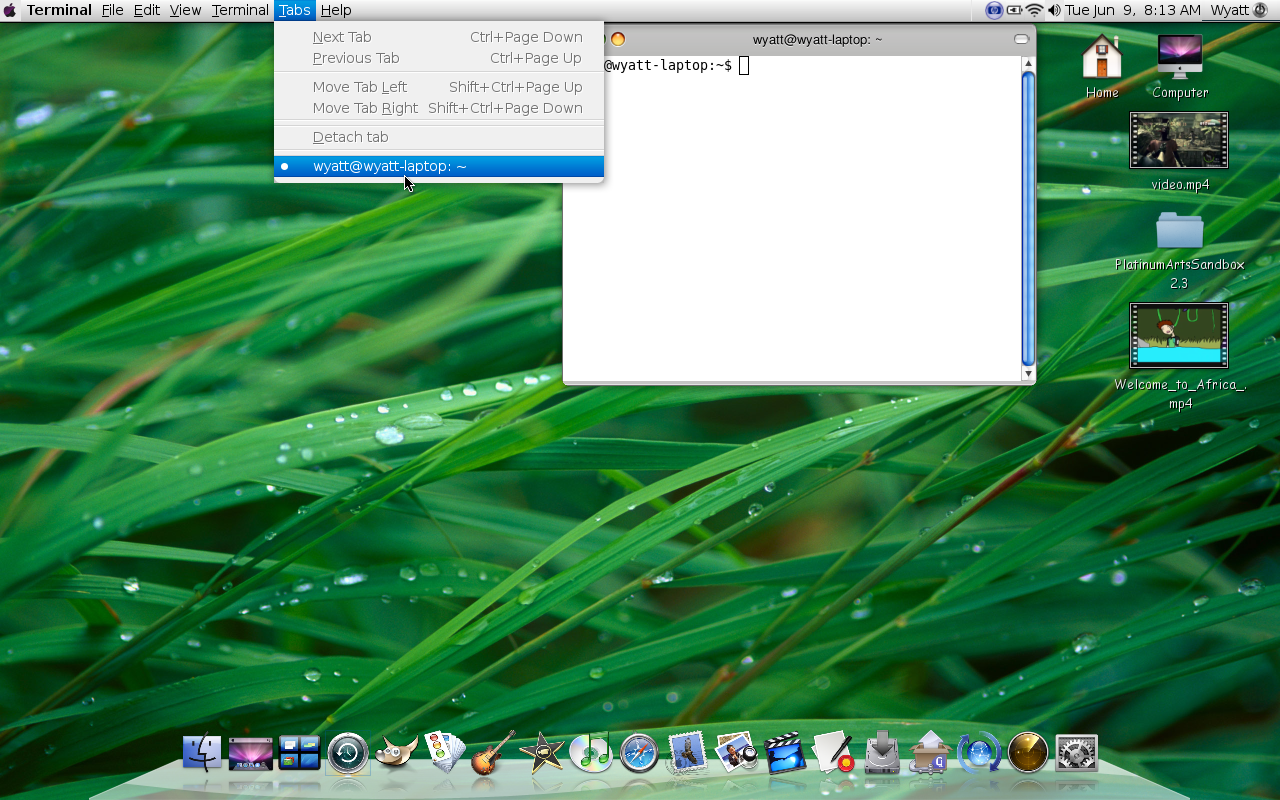
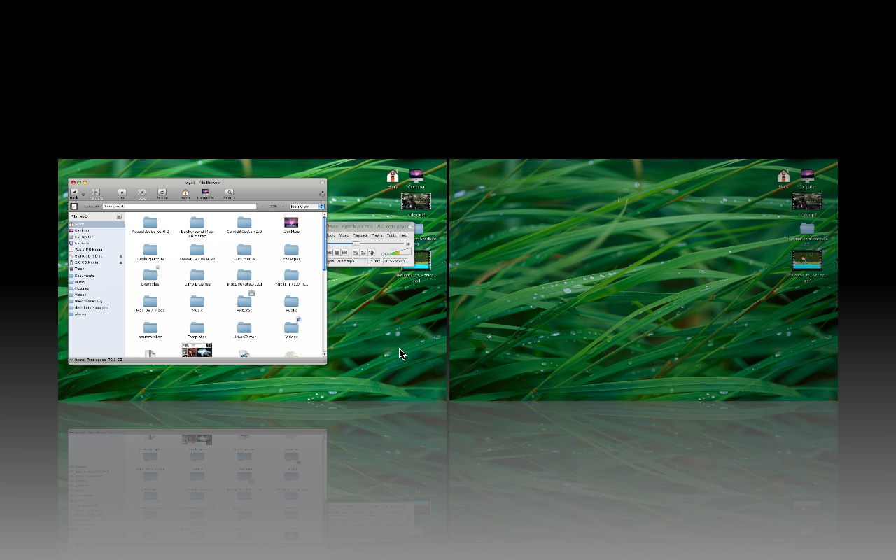
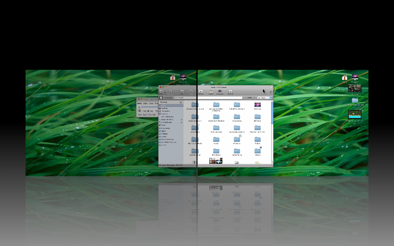
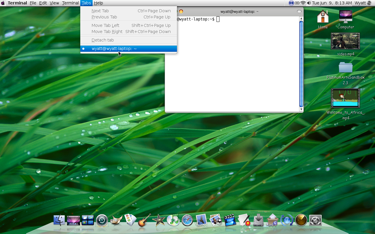
Here's some screens.