 Aqua-Soft Forums
Why does every font i choose for rocketdock look ugly? Any help or suggestions?
RocketDock fonts look ugly?
Maybe you could show us a screenshot. Try enabling ClearType.
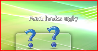
Here are some screenshots. In other docks these fonts render fine but in RocketDock they look too ugly.
They both have cleartype. The first one is arial bold and that does not look bold. The second image is tahoma and still does not look like tahoma.



RocketDock doesn't apply ClearType onto fonts, if I recall. It completely ignores the setting, I think.
Yes, Rocketdock ignors the font smoothing ... so almost all the fonts there looks ugly .... i had SOME luck with Myriad Pro, and Segoue UI(sp??) ....