 Aqua-Soft Forums
is iSpy coming back some time soon?
Forum Issues vBulletin 3.7
i don;t know if it was intentional for the move but, the <640x480 image resizer isn't on
iSpy will be back soon, same with the image resizer. Some reason the plugins that are compatible with 3.7 were not working for me when I did the upgrade. So I'll have to give them another shot later.
Hopefully I fixed the width and login issues. If you're still getting that error, please let me know what page you're getting it at.
I'm happily to report here I don't see no more the width problem as reported yesterday and I can confirmed the issue are solved 110% by this new update... 
Kudos! to Timan for a quick fixed...and thank you 
Since I can't seem to get the stats to work correctly,
Anyone here still on IE6? If so is it due to work/school or person pref?
Arrghh!!!...sorry because i speak too soon. The width problem still exist in IE7 (i seldom use IE). The issue only appeared in the main forum page. The other forum pages seem not affected (tested).
Currently I'm running Firefox 2 , IE7 and Safari 3 side by side (for test proposed) and i can confirmed the only browser affected was IE7...at least for me...sorry 
Arrghh!!!...sorry because i speak too soon. The width problem still exist in IE7 (i seldom use IE). The issue only appeared in the main forum page. The other forum pages seem not affected (tested).Currently I'm running Firefox 2 , IE7 and Safari 3 side by side (for test proposed) and i can confirmed the only browser affected was IE7...at least for me...sorry
working fine for me, just tested on IE7 (which i never use  )
)
So far it was okei, I don't encounter any problem. Well congrats for updating the board!!!
still waiting on my favorite features of aqua-soft, iSpy

Same for the number of posts per day not being displayed (as you can also see in DZGH_Operator's screenshot).
-NC
Yea, I'm not to worried about that bit right now. It should all be replaced this week with the new skin.
was it because of the upgrade that you can't see users signatures in their profile anymore? or did that happen before?
Ha, the skin right now that is set as default on this site is really screwed up. It works though...
If you guys wanna switch to the all new 3.7 version just go here. http://www.aqua-soft.org/board/index.php?styleid=29
I had to remove the development board at vastyles, cause vbulletin sent me a nice nasty gram, ha. Will def be done this week/weekend.
So if you guys see anything that doesn't look right, PLEASE post about it here. I always overlook certain bits of the skin.
I don't know if your getting to these, or noticed them but (in safari 3.1),
-on the main page, when your logged in, the font is 2x/3x times bigger than it should be (99% sure it isn't me)
-the pm mail indicator bar is still the gross, green/red/yellow default one,
-when you're sending a pm, the 'recipients' field has been pushed to the right
-the "Welcome, name" shows the users banner color, which is w.e, but the underline is blue, which looks weird if you have a colored name,
I don't know if your getting to these, or noticed them but (in safari 3.1),-on the main page, when your logged in, the font is 2x/3x times bigger than it should be (99% sure it isn't me)
-the pm mail indicator bar is still the gross, green/red/yellow default one,
-when you're sending a pm, the 'recipients' field has been pushed to the right
-the "Welcome, name" shows the users banner color, which is w.e, but the underline is blue, which looks weird if you have a colored name,
The Welcome Username text, are you getting a blue underline all the time? or only on mouse over?
Yea, most of the sections you've reported I havn't even touched.
- Showthread (postbits)
- Posting Screens (anything with an editor)
- Calendar
- Private Messages
- Social Groups
- Main page (custom to aquasoft)
only on rollover.
so the posts areas aren't staying like how they are now right? (they're terribly ugly)
Figured I'd give some feedback on the v4 skin.
1.) Live the postbit layout -- even though it is the default. Personally, I like the user title and user rank above the avatar rather below it. If the decision is made to keep it that way, I think that the postbit would look good centered or non-centered; either way... although I would leave the username/title above, and have the rank badges below...
2.) Bookmarks are great; hoping they can be changed by the user in the CP or something.
3.) Quote/Multi-quote/Edit buttons are also very pretty; loving the iPhone/iPod Touch theming hinting there.
4.) red/green online/offline badge is a great addition; I personally would like to see it stay on the final version of v4.
5.) Bottom-page links are just so sexy.
6.) I like how the "Welcome Username" device is set up.
7.) Profiles!
That's all I've noticed so far; will edit if I see more...
Edit 1: I think this says it all .
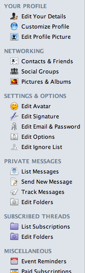
Ha, most of those we've already had. I just hid them from the version of the skin we use here.
Also if you want to see how bad the profiles will be in vb3.7 click my profile while using the new skin.
Yeah, I noticed it when CTMD had the 3.5 skin for a while.
And...  yeah, the profiles are pretty bad :X
i still got that occasional security token missing or invalid (something like that) when I login

i still got that occasional security token missing or invalid (something like that) when I login
Hmm, thats one thing I've yet to come across using the skin, could you let me know where exactly you logged in next time that happens?