 Aqua-Soft Forums
Where can I find the aqua window button images (red,green,yellow)? I would like to use them to emulate a Mac window/title bar for some custom web design (actually a div on a web page) when the Safari browser is detected.
Aqua Toolbar Icons


Thanks so much for the images; now off to emulate the look and feel of the Finder titlebar.
He he, glad I could help. Happy emulating. Let's see the finished product;).
Regards,
Dodgers.
OK ... but its going to be a few days. Do you also happen to have access to the mouseover versions of these icons (the X in the button)?
Yep. Here you go. A dark and a lighter variant.
Regards,
Dodgers.


Terrific ... Thanks again!
Attached is my first draft; I still have a few formatting issues to resolve. Any suggestions? Ways to improve it?
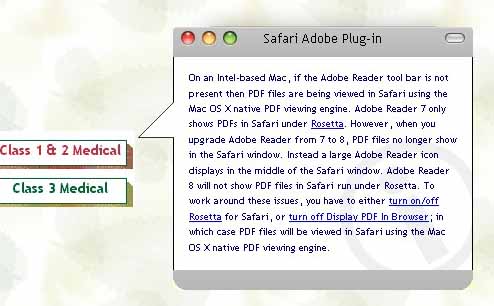
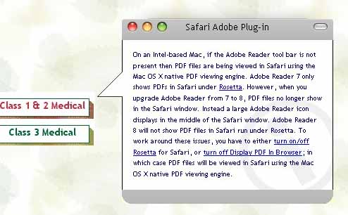
I think it looks good so far...I see you are going for a "leopardized" look. I think I would somehow move the black vertical outline to a horizontal, so that it separates the top/bottom grey areas from the white text area to make the window borderless. But I'm no programmer, so I don't know if it's possible. As to my personal preference I think the bottom rounded corners are a bit too rounded, but thats just me. So far it looks very good, especially the spacing around the trafficlights. All over it has a good look to it;).
Regards,
Dodgers.
Thanks for the feedback; its greatly appreciated. I seldom get feedback from my users on design/appearance issues with the websites I maintain.
Well, initially I thought about going with the "tiger" look since that is what I run on both of my MacBook Pros but there seems to be a lot of negative feedback in the forums on the brushed metal look (and I didn't have that background available). After a second look I agree with you that the bottom corners are too rounded and they are not consistent with the top corners. If I eliminate the vertical borders I am concerned that the "tooltip" will get lost in the surrounding page and not stand out. I suppose I could change the background color but I don't want to deviate too far from the "mac" look.
You're very welcome.
I had that thought too, with the tooltip. I would apply a gradient shadow to the sides and bottom of the window if possible, both to get it more mac-ish, but also to make the tooltip opaque on a white background.
You're right, alot of people in AS have had their share of Tiger, but I've got to say that I absolutely love Tiger. Leopard is great too, but Tiger is what comes to mind when I'm thinking of what defines a modern mac OS:).
Regards,
Dodgers.