 Aqua-Soft Forums
i need an opinion of a program logo i created in photoshop.
the title tells the story 
you can download the icon, all you have to do is ask 
http://ronnodesigns.deviantart.com/art/Sah...rminal-73374032
i need an opinion of a program logo i created in photoshop.
the title tells the story
you can download the icon, all you have to do is ask
http://ronnodesigns.deviantart.com/art/Sah...rminal-73374032
How about adding a little more to the logo? it's just a rounded bluetooth icon with a line near it . Maybe add something other than a line? i dont know, it looks good though
i agree... i haven't got time now but i think i'm gonna change the black line to a thin light blue line...
would that be better do you think?
Thanks 
Maybe instead of the thick black line, three consecutive thin light blue lines (continuing Ronno's idea) just to give the impression of a Bluetooth link / wireless transmission.
Edit: by consecutive I mean side by side, something like this: | | |
I like the text, but I agree that the logo could use a little something.
I was thinking maybe the Bluetooth "B" in the middle of concentric circles. So like:
((( ))
))
But with the parentheses being full circles around the "B". Everything could be that Bluetooth blue.
how about this? any better?
Maybe the arcs should be more concentric respect to the sphere, but at least to me it looks far better than the first.
I like that better, too. Now, I would make the Bluetooth icon a bit smaller. It's too big in relation to the type. Then make each signal arc wider, and apply the Aqua style of the orb.
I like this one better and think the size of the bluetooth icon is good. However, I'd suggest making the two lines consecutive with the sphere (go around evenly not bend into it, you know what I mean?) and add the same style to the "arcs" as the sphere
i dont know what you mean lol
show me
I'd love to.. but I recently switched OS's, and I'm without Photoshop 
Thought I might help out a bit. I just made the wave surround the bluetooth logo in an "S" shape to make it more relevant to the name and more memorable as a stand-alone logo even without the Sahara name on it. Yeah I know it doesn't look aqua anymore but it's just a study for you to think about.
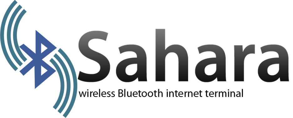
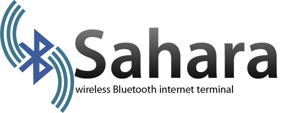
I like GameBoyzGB's version,
Those waves around the logo makes me think about Sahara desert dunes. Of course giving them an arena colour wouldn't be a good idea but it makes it be related to the name... ok ok, I'll stop drinking.
i took on the idea by matonga with the dunes refering to the sahara and used google earth in a desert tone, but im not sure about the wireless bands... there has to be a wireless sugestion, just not blue. anyway im sure you'll be able to help
As I said, I have to stop drinking