New Leopard Screenies

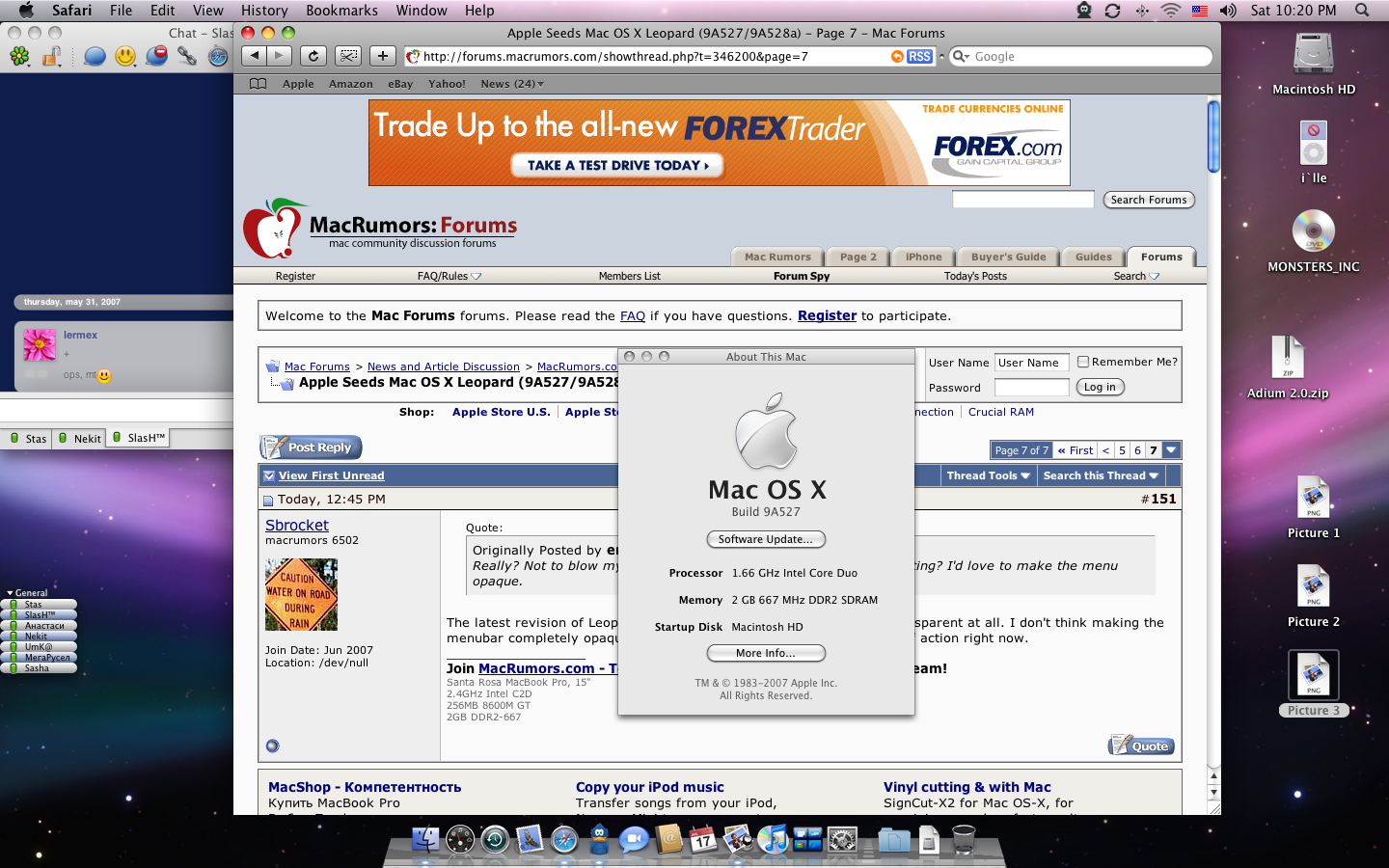
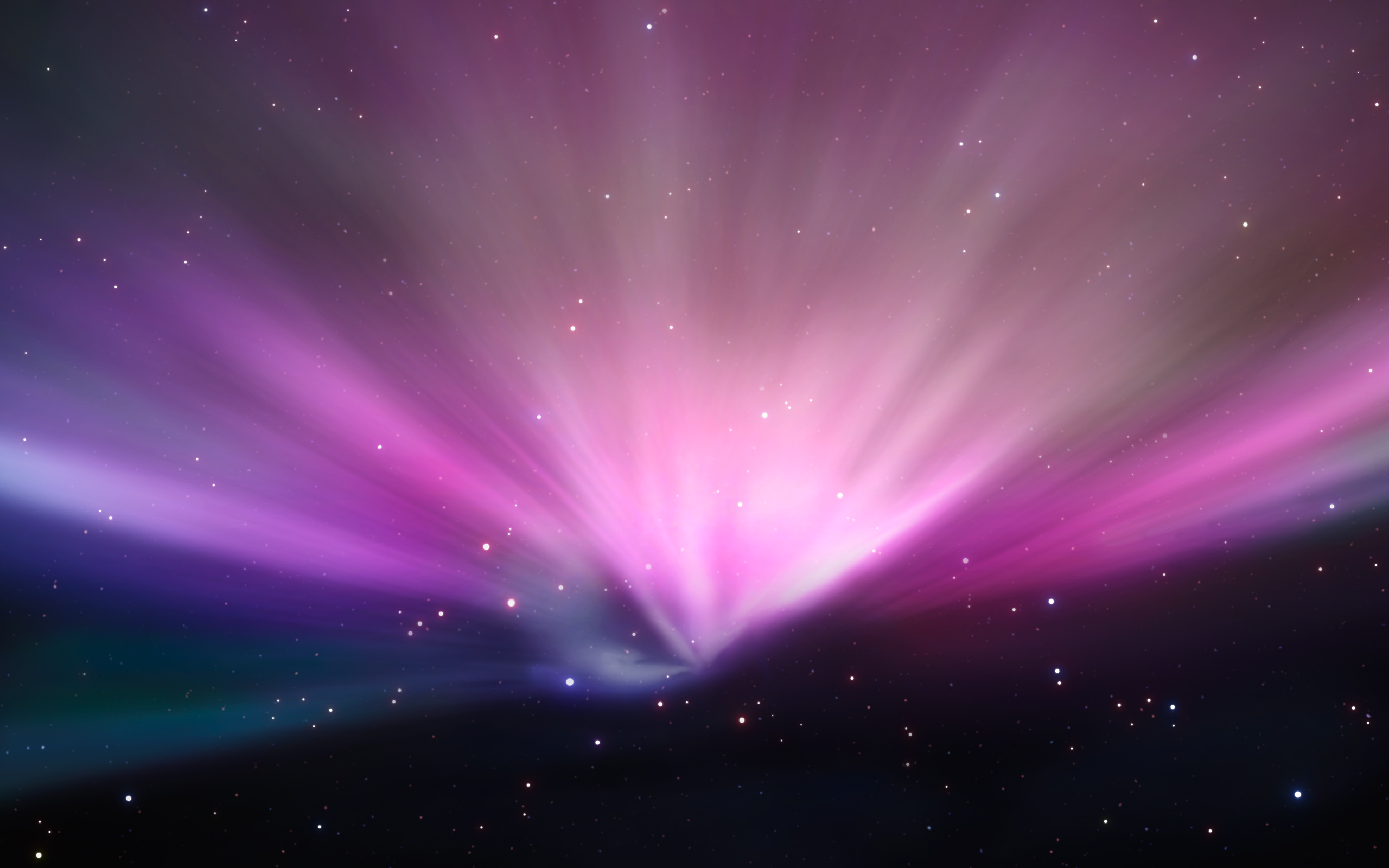
Well, friend of mine sent me these screenshots of the new Leopard build that came out last night. Has the new Space wallpaper but man on man does it look awful.

New Intro:

http://www.youtube.com/watch?v=hG7sAwv5Sj8

New caption widgets:

f1a77c208326afeb3ba499b96919d7ac.png

System pref icons updated:

0aab4d6e30f1e859f92a67ed7222f7ee.png

Desktop with the new wallpaper:

8b905e3a81aa8d02daa963cbe8b21b2c.png

Heres the wallpaper if you wanna download it.

#469685

Apple is making Mac OS X more "space" like and that's good. I can't wait until the final version. I think the Cover Flow scrollbars would look better with that background than the iTunes 7 scrollbars. So Apple might still make Cover Flow (black glossy) scrollbars standard through the entire system and that would look better for a space theme than iTunes 7 scrollbars. The iTunes 7 scrollbars look better on the Grass Wallpaper Leopard previously had.

#469687

Safari looks great with the new buttons, but I miss the rounded corner in the menubar. The traffic lights doesn't fit to the rest of the GUI... Thanks for posting these screenshots! :)

#469688

It just gets better and better! ;)

To my opinion, i do not like the new Traffic light buttons.

But, the menubar and dock (idk if it changed) are awsome! :cool:

#469691

Hmmmm... I don't know how I feel yet.

The transparent black menu bar is changed to a transparent white one (really no big surprise since they always change it around before the final release).

The stoplight glyphs are terrible. They can do better than that. It looks like a cheap Overlay PhotoShop layer.

The "Cold Steel" is growing, but I am not to the point which I would like it to be the default look. Hopefully, there is still a lot of work to do in the GUI department.

#469692

Updated first post with the new Intro, must be getting close to being done.

http://www.youtube.com/watch?v=hG7sAwv5Sj8

#469699

Errmmm... :| Not liking the sunken widgets much! I think they should redo them altogether, they just look out of place now.

#469701

Updated first post with the new Intro, must be getting close to being done.

http://www.youtube.com/watch?v=hG7sAwv5Sj8

Synths?!? Really!?! We're not in the 80's anymore...

Edit: Whoops. It's the same as Tiger's. Which is good. The sound and video do not mix well.

#469702

Meh..as long as we can customize Leopard I'm good.

#469706

I will always hate that dock, simplicity in it becomes obsolete, those gray lines gotta go, the wall is pretty nice

#469709

Is it me or does the apple on the top finder bar look.... off?

Also, whats diff. about the close min. max. buttons? Their brighter?

They also completely messed up the dock. I dont like its looks now... :(

Also, is the space wall the new default one?

#469712

Is it me or does the apple on the top finder bar look.... off?
I guarantee you that the Finder bar will be revised again. Remember Tiger's blue end-cap bar? Apparently, they can never get it right until their 13th time revising it.

#469713

Also, is the space wall the new default one?

Yep and I hope it will stay that way. I actually think the Space Wallpaper is pretty cool and will be good for the eyes (less eyestrain).

#469715

does the menubar have some gradient or is it like semi transparent toward the right end of the bar?

#469716

does the menubar have some gradient or is it like semi transparent toward the right end of the bar?

It looks semi-transparent. Just compare the color to the wallpaper underneath at any spot.

#469717

ahh!

*takes a short glance and hides under a table.*

EDIT-

*slowly surfaces to take another look*

IS it me or have they made the top left of the menubar/taskbar non-transparent and grey?!?

thats really bad.

But dont worry folks! as soon as I get leopard and as soon as shapeshifter becomes leopard native I will be porting my illuminous theme!

It works fantastic with coverflow in itunes, and would make a fantastic accompanyment to coverflow in leopard's finder etc!

spam:

previewup2.jpg

#469728

spam:

previewup2.jpg

It would be cool if Leopard looked like that and still has the space wallpaper. I think that theme is going to make Leopard even more "Space" themed.

#469731

Caption widgets are HORRIFIC.

#469733

What are "caption widgets"? Close, Min. Max. ?

#469738

What are "caption widgets"? Close, Min. Max. ?

Yes. That's right! ;)

#469739

Hmmm, yea, they seem brighter than in Tiger....

Is thats whats upsetting people?

#469740

It would be cool if Leopard looked like that and still has the space wallpaper. I think that theme is going to make Leopard even more "Space" themed.

hahaha yeah i guess u were right about the space 'theme'/feel... my bad.

I guess i will have to include the space wall in my illuminous theme for leopard ;)

#469747

http://www.flickr.com/photos/alexisalex/1234148438/

I don't know what they did, but I actually like the menubar now.

But, they seriously need to fix the dock, titlebar captions, and window shadows.

Also, It might just be me, but the scrollbar looks a little funked up, too.

#469755

Those black boarders around the windows look really ugly.

#469783

Apple's gonna end up letting you customize the transparency and gradient color of the menu bar. It seems for every person who likes the look, there's someone who dreads the idea of using it every day.

Edit: Gah! Read my post count! The day has come!

#469786