Pinstripe skin for Firefox on Windows

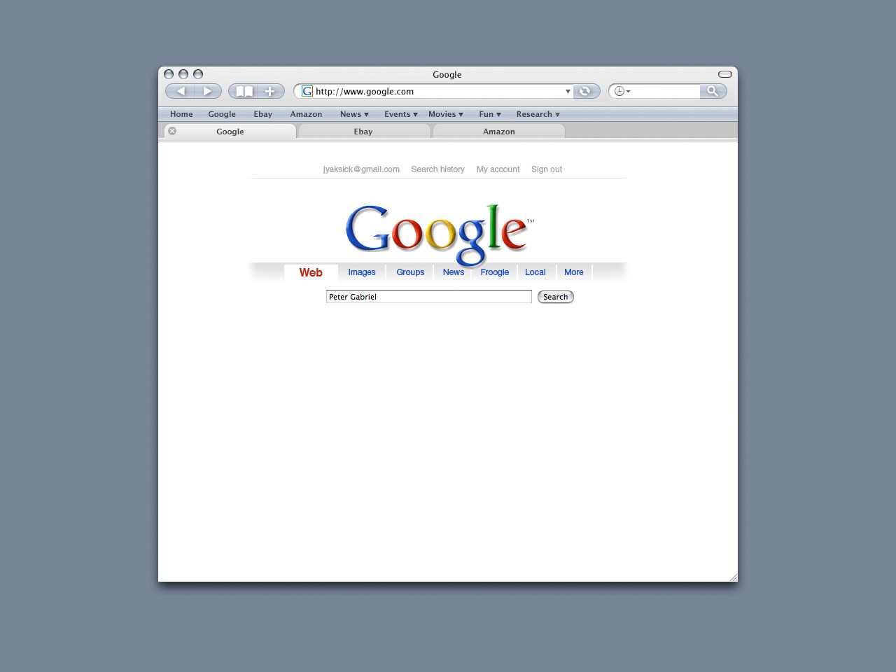
Please guys help me. Dont be ignorant.. its just a very nice pic i have, guess its a default Firefox theme for Mac OS, isnt it? If not, then i really want to find it for Windows (if it exists of course) and who but u can help an old modder from Belarus? )) Actually i was searching for a copy of Pinstripe skin for Windows, but..

Anyway, if u can help somehow, it would be very much appreciated ))
post-27301-1182885507_thumb.jpg

firefox2-tabs.jpg
firefox2-tabs.jpg

#461568

Are you talking about this skin?

Click Me

Yes, it does work for Windows too.

#461572

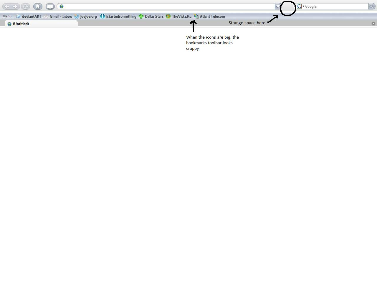
Oh yeah thats it, thanx very much.. Still maybe u know how to solve 1 bug with appearance? When I use big icons (buttons) in the toolbar, the bookmarks icons look as in the screenshot. Maybe u know how to solve that? Or if u dont have any problems with the skin, could u please post your userchrome?

P.S: the bug with 'strange space' is already fixed )) it was the 'go button'

post-27301-1182924511_thumb.png

121.png
121.png

#461584

That's a beautiful skin!

Hey iiswiis, you seem to be like a FireFox customization expert, do you know what I have to put in my userchrome to disable favicons in the bookmarks toolbar folder?

To be perfectly honest I would prefer the "black-mac-arrows" that's in the SS, is that even possible if it's not skinned into the, eh, skin? :)

#461604

Nerd:

Go back to the creator of the skin. My userchrome file is "as is" when I installed it... I have never modified it.

Warius:

Check out this thread: Click Me

It has all the info you need to customize Firefox.

#461613

2 iiswiis: guess its so because the skin is still in its beta stage. Will see what happens.. What skin are u currently using? Can u post a screen?

#461620

2 iiswiis: guess its so because the skin is still in its beta stage. Will see what happens.. What skin are u currently using? Can u post a screen?

Currently my own port: Alluvium Magnite

#461633

Thanks iiswiis, that was one awesome thread, can't believe I actually ignored it up till now.

Next up I'll be trying your a magnite skin. In the meantime check out my beautiful iFox :)

bilderman20070628135215lb7.png

Maybe I should take some time and try to skin the three extra buttons...

#461720

No. that iFox sucks and Prinstripe skin also.

This is the best Firefox skin - Flock skin

screenee3.th.png

#461726

Not bad, neighbor ) Im from Belarus, btw.

Прывітаньне зь Менску! ;)

#461729

Oh yeah thats it, thanx very much.. Still maybe u know how to solve 1 bug with appearance? When I use big icons (buttons) in the toolbar, the bookmarks icons look as in the screenshot. Maybe u know how to solve that? Or if u dont have any problems with the skin, could u please post your userchrome?

P.S: the bug with 'strange space' is already fixed )) it was the 'go button'

The bookmarks bar will be better themed for larger bookmark buttons in beta 3 and the go button will be themed too. :)

#462665

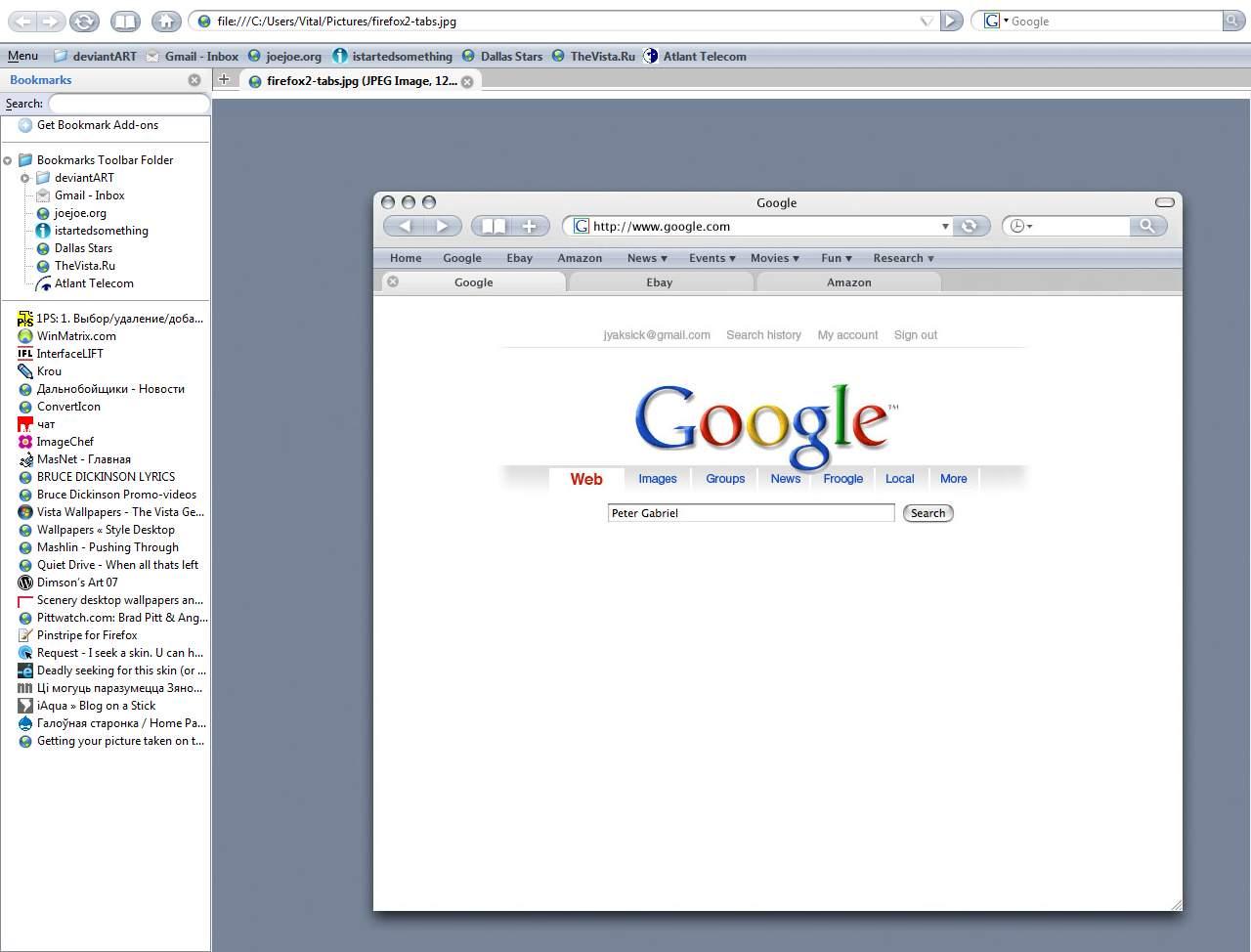
Thats awesome, TwisterMc, that u listen to peoples replies and pieces of advice and do changes in your skin!! Its closer to perfection now.. But still, bro, if u want to hear my advice, i can tell what i'd like to see in your skin next.. Well, i've attached a screen of how it looks on my PC (nice 'new tab' button, huh? :)) and u can also see the way your skin (IMHO) should look like at the end.. That would be just perfect.. So thats what i think is worth making in the next update. i'd like to see : the background of the main toolbar gray, like the color of tabs (if its possible), the line at the bottom between the tabs should be also gray, as on the screen of that 'FF2 project'; maybe its possible somehow to make a 'compact menu' icon to place it somewhere as a button for ex. just not to see it 'setting off' every time (if u understand what im talking abt); there should be the same space between the 'back-forward' button and the 'reload' as between other icons in the toolbar; btw it would be nice if buttons looked the same as on the screen of that 'project', i mean bigger and longer and the 'arrows' and 'bookmarks' buttons look better (imho) on the screen..; it'd be nice if someone could make the same 'google' icon for the search bar as on the screen (i cant find the correct size..) and btw it'd be very cool if we could remove the 'Google' word written in the search bar; it'd be nice if there were no 'tab icons' on the left, coz then the 'close button' would look clean and correctly i guess..; it'd be very cool to remove the 'bookmark icons' in the bookmark toolbar, just to see the bold text (as on the screen); and there should be a bit more space between the 'bookmark toolbar' and the tabs (i mean on top); one more hatch to perfection is that little cute shadow on the right of the tab, which makes the tab look amazingly 'convex'..

Thanx for reading it to the end.. i Hope some of my 'shameless & immodest' advices would help your skin to be PERFECT and the best one for Firefox.. I really will wait to see your work.. Best wishes, bro! U r the best

post-27301-1183759296_thumb.jpg

screenshot.jpg
screenshot.jpg

#463167

A few notes~

You can remove tab icons buy adding this code:

.bookmark-item > .toolbarbutton-icon {

display:none;

}

There is no search bar in the mockup. That's more of a history search bar.

Not sure what you mean with the 'add space' between the back and forward button, wont that defeat the look?

You can remove bookmark icons with this code:

.tab-icon-image {

display:none;

}

Overall, I guess my goal isn't to make an exact duplicate. Just similar. :)

#463265

So thats what i 'meant' (in the screen) ;) hope this can help. Because i really like that 'project' and thats my dream to see it for real.. I know it might be hard, but.. I believe in u, TwisterMc, coz i see u'r a real master. Ask if u need a beta-testing or some good advice, i'd like to help u..

post-27301-1183890873_thumb.jpg

screenshot.jpg
screenshot.jpg

#463412

TwisterMc, any useful help from me? )

#464096

nerd

1- Refresh and bookmark buttons won't get combined as people may use one, but not the other.

2- The bookmarks toolbar spacing looks bad because the favicons were removed. I know that's an issue, but it's not how I designed it.

3 - I'm unsure about the compact menu icon.

4 - The gray colors won't be all the same as it won't match the mockup and I think it'd hurt usability a bit.

5 - I doubt the go and search buttons will get wider. But I'll consider it.

6 - Replacing the G icon in the search bar is not something I can control in the theme, or not that I know of. Also, buy putting a history icon there, it'd confuse users and you can't get to the history for this bar.

I do appreciate the comments though. :)

[[Edit]]

Help me get iAqua public on the Mozilla Addon's site by going over, registering for a free account, then adding a review to iAqua which is stuck in the sandbox.

Thanks :D

#464328

I will. To the point u didnt get what i meant at some aspects.. I meant that someone could make this 'history' icon of the correct size for me to replace that 'Google' one in the search bar. Moreover i guess that it'd be OK if the 'refresh/bookmarks' icons r not combined, what i think important is that space between 'back/forward' button and the 'reload' one (that i've marked on the screen); the wider buttons are also very needed.. if its possible, it'd be very nice. I dont know what 'usability' could be ruined by the same color of tabs and other space on the skin, it looks quite nice on the screen of the project, doesnt it? U can maybe post screens of your work, if need be.

[[Edit]]

Any news of the upcoming update, TwisterMC??

#465126

All updates as of now are live. :)

#465425

Im sorry, i cant understand u. Let it be because im from Belarus )) Does the work go? Are there any great ideas in your smart head? ) Will there be any big updates for your theme, coz im using your skin and nothing else and want it to look perfect..

[[Edit]]

So maybe we can wait for the next version, TwisterMc? )

#465988