My First Real Design

Hey, I'm back in here, looking for more critique. This time, though, it's a bit different. For this time, I've completely designed my own site in HTML and CSS, which was a fun experience. Unlike the main page where I found a template, I am proud of myself for finally making my own design. I will have to do some research though on how to turn it into a wordpress template, but this is okay for now.

Here's the link: Enjoy!

Feel free to critique, I can take it, but don't flame.

The design and creation was inspired my Virb profile, and maCocao.com, for proving more to myself that I needed a small (literally) fixed layout HTML page for myself.

//Thread Moved, Tagged. -NC

#448667

It's pretty good, but very simple.

Here are some tips to help improve it.

-The banner is too dark, and That style doesn't really fit with your layout.

-The padding in the navigation needs to be even; the links are closer to the bottom of the bar than the top.

-A background or font color rollover would look really nice for that navigation.

-I think adding a new box around your content with the same style as your navigation would add more elegance to it.

-The copyright is lacking a bottom border, needs to be added.

-The background is great! :D

Just a few things that would look better in my opinion. Good Luck! xHTML/CSS is fun! :P

#448678

Thanks.

-I'll try and find a banner or photograph one, maybe some of my photography in black and white would work.

-I'll work on trying to fix the padding, I didn't notice that.

-What type of background do you think I should use for the navigation, or what do you mean by font color rollover. Like, a hover and change the color?

-I'll see if I like the box around the content.

-Thanks!

Thanks for your comments, they'll help a bunch (I'm partly using this so I can get my family members to pay me for setting up their personal websites, but never free. Other than that, I wanted to use it to learn CSS.)

Edit: I did all the easy things, I added a box around the content, added a rollover, put a complete border around the copyright, and I think I fixed the padding.

I have a question, though: Do you think this ( http://img158.imageshack.us/img158/6937/picture1yi5.png ) looks better, or the way it is now?

#448679

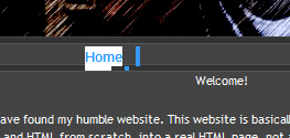
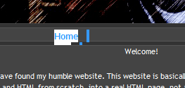
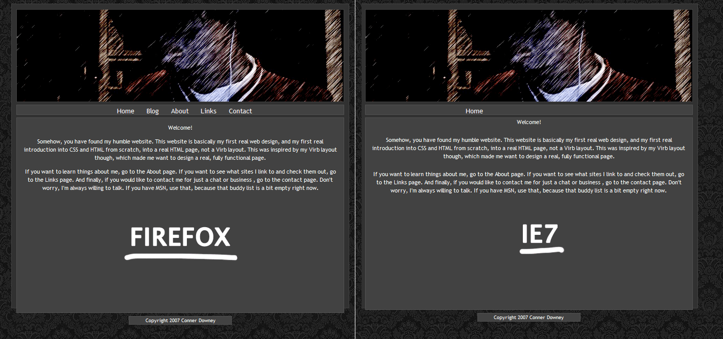
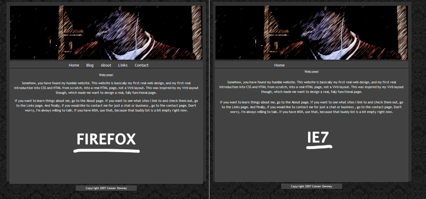
Ok, I assume you're on a mac, because your navigation is completely messed up in Internet Explorer 7. Instead of being horizontal, the list is vertical, and it goes behind the content. Also, your content box extends past your container, which isn't good. Also, I don't know if it's supposed to be this way, but the copyright box is outside of the container (I think it looks better that way). I would leave the font styling the way it is, but maybe choose a a less curly font (verdana, calibri, lucida grande).

An image of what I mean about the IE7 thing is below. I highlighted the list to better show.

post-51445-1174846619_thumb.png

jjcd7.gif
jjcd7.gif

#448813

Ugh, that's annoying. I've never had to deal with bugs before, that's annoying.

Can you show me a whole screenshot?

#448814

IE7 and Firefox 2.0.0.3

also, I took a look at your code, and you don't have quotes around your classes or ids, and that's invalid. It should be

and
.

To fix the problem of the over extending content box, simply take the height attribute off of #content.

post-51445-1174862674_thumb.png

jjcd7.gif
jjcd7.gif

#448846

I love horizontal menu!!!

#448861

why did u put every link in a different folder... i guess there is nothing wrong with doing that but its just weird to me

#448864

That's actually a very popular method, but mostly with sites that have very large amounts of content on each page. It's all about personal preference, it doesn't affect load time or anything.

#448873

I do it because I know how many pages I'm going to have, and it keeps the link uniform, and nice looking.

In my opinion, having an index.html in a folder like about, looks nicer than yoursite.com/about.html

I don't have many pages, so it's easy, and I never lose track of tha page I'm on.

And, thanks again Jake Moore, because I've seen macacao and I really like the design, so I'm glad to have a good web designer like yours's input.

EDIT: I also have no idea about how to do this, but how would I adjust the menu's differently in only a certain browser, like have a different amount of padding in Safari, IE, and Firefox?

I think I need to keep the height on the content, because I want the footer to line up (see below), and the size of the content to be the same on every link.

picture1at5.png

#448910

Jjcd7, Internet Explorer specific styles are easiest. You can also find a few other methods by searching Google for "browser specific hacks."

-NC

#448930

Okay, thanks, that's what I'm looking for. This is probably and hopefully going to be my last day working on it, as I have to go back to school tommorow, and I really need to focus on that. It'll still be a fun weekend project, and I thank everyone who provided their input.

#448956