 Aqua-Soft Forums
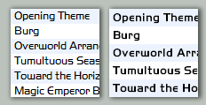
Okay, quite a few people have asked me how I made my fonts to look the way they are, so I've decided to create a tutorial instead of regurgitating the same process to people every single time. Attached below are what my fonts look like before modification (with ClearType) and after modification (with Grayscale rendering). If you like what you see....read on....
The left side snapshot is HandelGotD with ClearType (full preview @ deviantART).
The right side snapshot is HandelGotD with grayscale rendering (using this tutorial) (full preview @ deviantART).
http://www.aqua-soft.org/board/attachment....ntid=6544&stc=1
* This method has been tested only on TrueType fonts (.ttf). Other types of fonts such as Type1 or OpenType fonts seem to use a different method of rendering in Windows and as such, the steps described below may not apply to these types of fonts.
* This method has been tested on CRT monitors only. I have a NEC MultiSync FE700+ 17" Flatscreen CRT and all my testers own CRTs. I am told that this method does not look quite as well under LCD monitors, although I have never tried it on an LCD myself.
* When you modify fonts, you are modifying it from the original so be sure to adhere to any copyrights bound to the particular font.
Grayscale Font Smoothing with TrueType TTF Fonts
By JesterMania
For this tutorial, I will use High-Logic Font Creator available at http://www.high-logic.com . A free trial is downloadable there. This tutorial is in no way restricted to only this program and can be applied to many other font editors. I just happen to use Font Creator for my own work. If you wish to use FontLab Studio 5, instructions are given further down by Paralex outlining the method for that specific edititor. This tutorial will assume you know the basics of operating Windows (as in how to copy/paste files, how to install fonts, etc.). In this tutorial, I will be using the HandelGotD font (HandelGotD.ttf).
1. Preparing your system
If you don't have a copy of the font file available, all your installed fonts are located in C:WindowsFonts, so you can copy the font from there into a separate location to work with. The reason for doing this is so you always have a backup of the original and working with fonts directly in the WindowsFonts folder is not a good idea. Make a copy of your font in order to modify now and rename it to a name different than its original (not required, but recommended - i.e. HGSmooth.ttf).
Enable "Standard" font smoothing. This can be done by right-clicking the desktop and selecting "Properties". Click on the "Appearance" tab and click on the "Effects" button. Ensure "Use the following method to smooth edges of screen font" is checked and select "Standard" and click "OK".
RESTART YOUR COMPUTER (trust me on this one).
*NOTE: If you are using Styler, unchecking "ClearType" under the "Desktop" tab turns off font smoothing totally. You still have to go and activate "Standard" font smoothing as described in the above paragraph.
2. Renaming your font
Open the copy of your font you would like to modify in Font Creator (File->Open).
(Format->Naming). Under "Platform", select each entry and on the right-hand side, replace the any text string with the font's original name (i.e. "HandelGotD") with a unique name of your own (i.e. "HGSmooth"). Be sure to click the "Advanced" button and ensure the names in there are changed also if they happen to exist. You can ignore the other text strings that contain the font foundary, author, etc. - only the name matters.
When you are done with each "Platform" and each "Language", click "OK". You have successfully renamed the font.
3. Enable GASP at all sizes
(Format->Grayscale) and delete all entries under "Gasp Ranges". Click the "Insert" button, check "Grayscale Rendering" and click "OK". You should have a single entry which says Limit: 65535 Flags: Grayscale rendering. Click "OK" again to close the dialog box.
4. Adding boldness to the font
At this point, you can start using your font (by installing and launching an application such as wordpad to test). I don't recommend using the default previewer in Font Creator as the quality of the results aren't accurate. Usually, the font will appear very light and faint, sometimes barely readable at this point. This is a problem with the Windows font rendering engine and this step will provide you with the means to darken the font to a level of your liking.
(Tools->Glyth Transformer). Ensure that under "Range", "All" is selected. Click on "Effects" dropdown and select "Bold". Click the -> arrow to add it to "Script". Under "Horizontal", enter the value '5' and in "Vertical", enter the value '4' and click "OK".
*NOTE: This adjusts the strength of boldness applied each time. In my experience I get better results by bolding a little each time. You can try other values other than H:5 V:4.
You have now successfully darkened your font. Save the font, reinstall it, and test it. Repeat this step over and over until you get the boldness strength that you like. You can use the same boldness strength (such as Bold(5, 4) each time, you needn't increase the intensity to make the font bolder).
That's all there is to it. As a side note, this type of font rendering will make your fonts appear "fatter" when the letters are displayed in a light colour (such as white). You may wish to create one font for dark-coloured text and another for light-coloured text.
+ Addition
Instructions for FontLab Studio 5
By Paralex
For those of you who use Fontlab Studio 5, I found a quite simple/easy/lazy way to do this.
Open up your font in Fontlab studio.
Go to Edit > Select All. (This will select all the characters.)
Next, go to Tools > Action > Effects > Bold. Set the H weight to 5, and the V weight to 4. (Just like in Jester's settings in Font Creator.) Click OK.
Then, go to Tools > Repeat Bold/Outline. Then do it again. (This will cause the Boldness to be applied 3 times)
Don't know how to save as TTF?
No worries, just go to File > Generate font. (Or just hit in Ctrl + Alt + G) In the click-down box next to "Save as Type", select "TrueType/OpenType TT (*.ttf)" and save it anywhere (best place to put it is in C:WindowsFonts)
Enabling Grayscale
To add enable grayscale font smoothing in in FontLab Studio:
File->Font Info
TrueType-specific settings->Font smoothing
On the right pane, you will see "PPM Ranges". Here, you can specify the font sizes which are smoothed. For our smoothing purposes, make sure each font range has "Apply instructions to range" (hinting) is unchecked and "Apply smoothing to the range" (grayscale) is checked. For example, I opened up the font "Agency FB", and the settings were:
0 - 8 S
9 - 16 G
17 - ... SG
And after changing, you'll end up with something like:
0 - 8 S
9 - 16 S
17 - ... S
How to change the font name.
(Just in case you want to install the regular and modded font)
Go to File > Font info. (For example, I am using Lucida Grande for this. And I want to change the name to Lucida Grande Mod.)
Go to Names and Copyright. (Make sure you keep the copyright statement from the original creator!)
I would simply put it "Lucida Grande Mod" into the Family Name, PS Font Name, Full Name, Menu Name fields.
Then go to Version and Identification. Change the version number by .1 (Such as if the original version was 2.0, you would simply change it to 2.1)
Then save.
Enjoy!




 . First of all, yes it's true most other fonts don't look that great without ClearType. That means to get around that, you'll probably have to make a set of fonts. There's not too many though considering that you'll probably only be seeing two fonts frequently: one for the UI (used by the visual style), and another more "readable" font (used for web page rendering - you can specify the font used in most any modern web browser). Also, please note that Type1 fonts (such as Souless' fonts) display great under Standard font rendering as Windows displays these fonts using grayscale regardless of whether ClearType is on or off, unlike TTF and OTF fonts which are displayed differently. You can test this yourself. So, using a Souless font for web page rendering for example would work pretty well in combination with your own custom UI font.