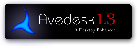
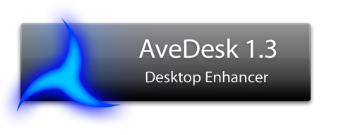
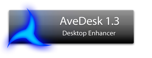
Logo design for Avedesk

Hihi

I've been following the aqua-soft comunity for over a year and I felt it was time i contributed something back to this amazing community. Although I know nothing about writing applications, I'm able to design things in terms of aesthetics. As such, I thought I'd come up with a design for Avedesk 1.3 as it truly is an amazing program that we've all come to love. I'll probably post more later on but i thought I'd start off with one that isn't too far off from Ave's original logo.

I'd be happy to see other people posting their own designs of Avedesk's logo on this thread too. I think a great app like Avedesk deserves a good logo and this community has one of the best designers I've seen so far so i'm pretty sure someone would come up with something good.

I'm not sure if Ave himself would use any of these logos eventually, but its worth a try =)

and before i forget, thanks to Ave for the great program.

avedesk.png

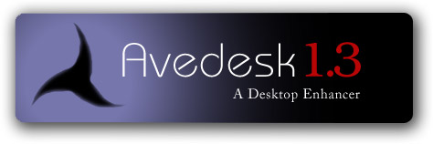
another variation:

avedesk3.png

#326287

like where your going with the first one, dont like the font for avedesk1.3.. should be at least bold

#326299

I only see 2 banners 'Image Hosted By Tripod' - no links, nothing!

#326303

Thats odd....anybody else having problems seeing the images?

#326307

I can't see them either. [EDIT]Hehe... maybe I should read the entire post next time...[/EDIT]

#326310

Hi all...

i added links to the images for those who can't see them....

just click on the images...they should link you to the images...

Let me know if anybody still can't see the images >.<

Sorry abt it!

#326327

@nellyfant, tripod.com does that always. They don't allow direct linking of images hosted in their site due to bandwidth stealing reasons. Maybe you can provide a webpage that includes the images for there's no way we can see them images. Even if we click the link.

#326330

aaaahhh...i hate tripod T.T

i uploaded the file to the aqua-soft server...i hope this works T.T

post-16490-1130375246_thumb.jpg

avedeskcompressed.jpg

#326343

and the other one...=)

post-16490-1130375382_thumb.jpg

avedesk3compressed.jpg

#326345

Whew! You had me scared for the moment with the new "Tripod AveDesk"...oooohhh!:D

PS. Nice work.

#326376

I like the first

#326383

The first one is awesome.

It could really go for a subtile graident in it.

#326529

The first one is better,great logo

#326532

I agree the first one has got a better logo....what about a mixture of the two? like an inward blend with the black on the inside....i'll make a pic of what i mean in a minute or two

#326535

Please drop the serif font, it doesn't play well with such modern design.

#326544

I guess i´ll go for #2.

The black Avedesk logo and the fading background are really nice....

Another font and it would be perfect ;)

#326549

Since the logo looks like the Klingon symbol, why not have a similar font?

#326556

Anyone like my idea (this is not a small cry for attention)?

#326618

I really like the idea of creating a fresh new logo for avedesk 1.3's recent release, so after some of your inspiration here's my mockup of a light version I threw together:

avedesklogo.jpg

#326645

Nice one Link.

#326647

Excellent work Link

#326649

I'll just submit my blatant rip-off of the orginal logo. I like the simple look.

Edit: I switched to Myriad Regular... it's all I got!

post-5731-1130455417_thumb.jpg

AveDeskLogoRemix2.jpg

#326672

@Link: if your design had more vivid colors....

@sketching: if you could use Myriad Semibold or Bold instead of Tahoma/Verdana...

...then your designs would be much better IMHO :)

#326674

Nice logo's :)

MyriadBold :yarock:

#326680

@Pe8er: Easily Fixed:

avedesk2.jpg

@Ave: I used futura :)

#326698