 Aqua-Soft Forums
New ipod balck and white icons

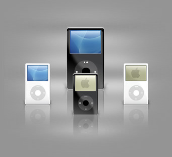
*whistles*
gorgeous. Just like the iPods themselves =)
now, if someone would like to donate to the AUTNIP* fund, I'll be able to use them.
* Arathon Upgrades To New iPod
the icons feel too aqua-y. the new ipods ARE flat now like the nano and have no smooth corners (besides chrome back). you made it feel like the 4G. nonetheless the white ones are good the the black ones' stroke looks awkward