[preview] Luna Element 4 for iTunes 5

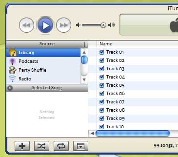
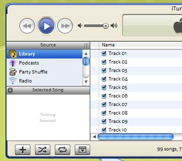
I'm trying to keep the look of XP app. Not sure if I could continue work on it because it looks a bit weird. What do you think.

I didn't do the insides of the player yet.

http://img374.imageshack.us/img374/6987/le41ob.jpg

-----------------------

Image linked. Biggest allowed inline image size is 500x375 px.

Pe8er

#318928

Dude, it looks pretty awesome! I mean, I basically just stick to Aqua stuff, but if I didn't, I could see me using it

#318929

Nice. Sooo tired of the grey iTunes. That's a big part of why I stopped useing it.

#318930

the round coners are not smooth.

the aqua blue must be lighter. I think :P

Nice

#318935

This is seriously nice stuff (and an original idea too) - I say keep working on it.

Maybe do something about softening the 3d effect of the screen - it looks like a giant button right now :)

#318939

Sorta cool, and I would use it if I had iTunes 5.

Keep it up!

-NC

#318940

****ing sex-ay!!

#318942

Why not try making the bottom corners round? :)

#318943

i like this theme!....um could i perhaps borrow the image you used for the text display screen thingy for a theme im making? (brushed safari ruler style).....i just want to use it as a base

#318946

i think it looks great, but instead of the inside being the sandy color, why not just use the regular blue/black colors from the titlebar

#318949

very nice! i will definately use this once you are done :).

#318970

Thanks for all the supportive replies. I am going to make two differnet themes. One that looks like that, and then another that is all blue, like the titlebar.

@gtn - thanks. I'm working on an alternate for that middle thing.

@S@m - I didn't think about that. Thanks for the idea.

@zondajag - well, that graphic was pieced together from the minimize button because It was hard for me to match it the best I could from scratch, so its not really my work. I'd check out the creater of the msstyle and ask him, unless I can give you permission and I do if its up to me.

#318971

Like the idea. Have you tried it with a simple white screen with soft shadows inside?! Love the buttons. Little to wilde (to realize) but nicely colored.

Keep on.. Cheers

#318979

I was under the impression that I can choose whatever width for the borders, but iTunes compresses the width to 2px, and the one I want is 4px. Any ideas. Did I forget a mask somewhere?

Here is a show of what I have so far running in iTunes, and it shows the border problem too.

The play button looks like that because I originally made it too small, and then decided to resize it, but when I resized the mask it didn't work like it was supposed to, so I'll have to remake the button.

post-20407-1127922473_thumb.jpg

itunes.jpg
itunes.jpg

#319041

looks really neat czanchez!

if you could get that cool border to go all the way around, i would really like it

#319052

Hate Luna, but for some reason REALLY like this. It's so easy on the eyes and clean!

#319097

Holy crap Czanchez the original beta looks awesome. It would make a wonderful change compared to other iTunes skins and would look great on a XP style desktop. Hope you can get it to resemble the original screenie!

#319181

http://img73.imageshack.us/img73/8515/mfka3oy.jpg

Here is my latest version. Everything is running smoothly, but the buttons are really time consuming. I'm still thinking of something to replace the windows flag.

I still have the border problem, so I will probably just make them smaller to make things easier.

#319413

go ahead and make the bottons smaller. it will look okay.

also i for one really don't like the windows flag. but eh.

the search thing looks kind-of weird to with the white box and all. i don't guess that is changeable though.

#319501

This is looking very tidy I must say.

#319505

I really like it. I would say that the color of the inside should be somewhat different - somehow it just doesn't seem to match or something. Possibly less of a cream color, and maybe a bluish tint? Test it with transparency on too - I can imagine it looking really nice with transparency if it were more of a neutral color. Also, The borders would probably look better if they were lighter - I guess what I really mean is that everything in dark blue could probably stand to be a tad lighter. But maybe that's just the Aqua fiend in me. =D

And agreed - something besides the Windows Flag, please. =)

This skin looks more promising than any of the others I've seen - keep up the good work!

Peter

#320930

I liked the first version a little better. I know some people disliked the royal blue of the display pane, but i liked it and how it coordinated so well with the buttons - the whole theme looked unified. I liked it because it was so simple - there wasn't too much going on and it was thus really pleasing to the eye. I think it's gotten a little bit too busy now.

#320973

is this still a WIP? I'd love to see it completed for iTunes 6...

#324251

I kind of lost the working version ... :slant:

Anyway, I'll redo it for iTunes6. Sorry its taking so long, schools is a real bog down recently.

#324280

Here is the latest thing. http://img475.imageshack.us/img475/5144/untitled13zl.jpg

Funny thing happened. I'm not one to make excuses, but the reason this is taking so long is that I lost the almost finished copy (the screenshot from 3 weeks ago) so i had to rework it. But that might have been good. I fixed the border problem.

The blue one is almost done. I still need to do ..

+ Menu Button

+ Various Buttons (equalizer, album art, add playlist, those annoying buttons at the bottom)

+ Scrollbars (not hard, I might finish those tonight)

+ Figure out what to do with the search bar.

+ Make Control buttons for Mini Player.

The Sandy one needs everything, but the scrollbars and Various buttons can be used for both.

#325980