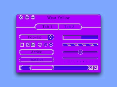
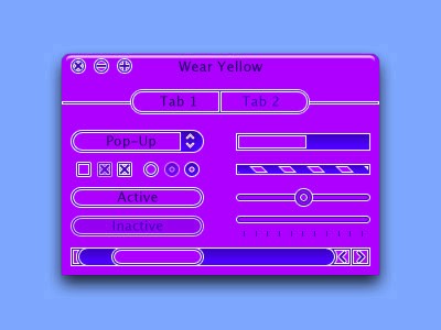
[mockup] Wear Yellow. Live Strong

WearYellow_aquawindow.jpg

WearYellow_metalwindow.jpg

Go ahead and flame me for posting such a bright theme, i'm still going to do it.

-Pat

//oh and http://wearyellow.com/ . In case you didn't know Wear Yellow is the slogan of Lance Armstrong, a cancer survivor and winner of Tour de France. Purchases of LIVESTRONG bracelets go to the Lance Armstrong foundation that supports cancer research. $1 for one bracelet in Nike stores. Available in packs of 10s and up on the nike website.

#243667

i dont think the orange in the contrast is so nice... but i realy like it so far

#243669

It would only look good in purple....

Looks good, I would work out the glyphs. They look like something Microsoft would do.

#243672

not bad at all........

#243681

Need I explain why I love this?

Amazing, Pat, just amazing! ;)

Yellow is the only way to go!!

#243692

very nice! though it seems like the arrow bracks are a tad too large IMO. but otherwise it looks great :)

#243698

daggers...in my eyes...AHHHHH!!!!

#243703

Maybe just a tiny tiny bit less bright on the yellow, and different buttons... what if you went with a "sun" motif for the buttons? (on mouseover, perhaps, show little "rays" around the buttons) It'd be kinda cool, then inactive buttons could be "moons" or "stars" instead of suns.

#243712

this makes me wish I had a mac... I'll get one soon. (g3... that's all I can aford at 12 :sigh:)

#243721

for the ammusement of wizard.

post-111-1105084595_thumb.jpg

WearYellow_wiz.jpg
WearYellow_wiz.jpg

#243725

jesus, that's yellow

i got me one of those bands too

#243752

somehow the sun jumped into my monitor and theres a glare when i try and look at the pic, could u post one not soo bright???

jk looks nice ;)

#243788

@Wuzzie: you might get a ban if you don't edit that part out in your post about you being under age...

oh and the orange is supposed to illustrate the depth of the engraving in the live strong bracelets

#243836

Looks really good man, rather bright, but if your going to have/use yellow thats whats going to happen. I think it looks pretty darn good though, maybe when you release it throw some color variations in there. But I think its good, nice work :)

#243853

The second looks real good, but for some reason I don't like the glyphs....

#243854

i really like the finder (i love orange) but the 1st is too bright. we need a windows port

#244142

It looks like Oscar....:slant:

#244230

ermm what's oscar :slant:

#244260

Hey Pat/Lu,

As a Yellow connoisseur, I have had to put up with nay-sayers all my life : 'Oh, that's too bright' or 'Urrgh! It reminds me of vomit!'.

Don't you pay them no nevermind! Yellowness is righteousness!

Oh, and though it does look similar to Oscar (a WB theme - search for it), the two are not the same. I MUCH prefer this . Thnx Pat :cool:

#244272

Not really my cup of tea :/

#244362

Wow...that's... very yellow. O.o

I actually kinda like it, but I might suggest you tone down the white borders a bit if you're actually going for an etched/3D effect. Otherwise, looks.. erm.. great. ;)

#244372

mmmmmmmm, nice

#244386