Need some feedback

On my website/blog. It's located here when I started it I was surprised the domain name was available. I am kinda stumped on what to do with it. Right now its a daily blog using pMachine Pro. I was gonna start a forum there but phpBB forums are really hard to theme and I don't have the money for a vB/iPB license. So I guess I am just looking for feedback and opinions on what I could do to make it look/function better.

Thanks,

Laurence Anderson

AKA LarryISKewl

#240430

It's a bit ugly. Plus why on earth are you using an image map for the links?

The "Ultimate Mac" ad at the bottom is a dead link.

Do you have permission to use the half-orb icon in that banner?

Lastly, as a personal aside, anyone who frequents the dump that is Spymac won't have fond memories of you so be careful where you tread :).

L.

#240972

hmm i think you should just keep a blog.. to many forums out there.. unless your going to get serious with a forum dont bother.....

#240978

erm I don't see any of those except the image map...

#240979

any of what?

#241043

i don't like the overall design, you should make it either wider or crunch it up a bit. I think you should align your links in the center, choose some better colors, and some more spacing in between the icons and the text under them, and get rid of the vectorized person, doesn't really fit in the toolbar.

#241427

Haha, lots of criticism. Although that's usually the best thing to get for websites, it can be tough. Here are my suggestions (short, to the point, and mean):

Far too much grey. Make the background for the content a bit lighter, and remove the background for the dock imitator. And if you actually want to get a dock, there's some code floating around; search the forums.

You need copyright notices for the Apple icons.

Use CSS for some rollover effects for links.

More as it comes :).

This is definitely a very nice start though!

-NC

#241430

Your site has this basis for greatness. All you have to do is move around the images a bit. Heres how I invisioned your site as a blogging one (just for ideas): http://screenshots.haque.net/screenshots/v...nshot-23982.jpg

Theres a ton of ways you can make your site design more appealing, get cracking ;)

#241446

Your site has this basis for greatness. All you have to do is move around the images a bit. Heres how I invisioned your site as a blogging one (just for ideas): http://screenshots.haque.net/screenshots/v...nshot-23982.jpg

Theres a ton of ways you can make your site design more appealing, get cracking ;)

how wide is the content in that? also I'm not amazingly good at CSS (I use CSS Edit) so that might be why i do what I do. But I like that idea you made.

#241689

Dunno, i just made it less wide, i didn't actually measure it, i just tried to make it look better.

#241690

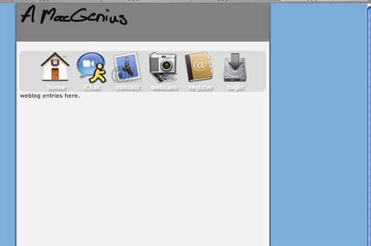
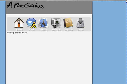
How's this so far?

post-23156-1104504411_thumb.jpg

amgscreen.jpg
amgscreen.jpg

#241899

Looks good, except the mac genius sign should be centered in the gray area as opposed to higher up. Too much space in between your toolbar buttons and the white space above them. and keep going! :)

But ultimately, you're your own judge. If you think something looks fine, theres no reason to change it because someone else tells you to. (just keep it in mind)

#241943