[Release] Bz Aqua Sunken Milk

Bz Aqua Sunken Milk

Updated now for wb 4.4

Original Theme by Max Rudberg, Mod by Shark

Thanks to shark for allowing me to port his mod!

Okay... Some new stuff in this theme. First off... I am very pleased to let you all know that the buttons in my "preferences skin" are no longer useless! I have linked them to work a lot like they do on the real mac osx complete with pressed states. :) Sound and Display are not working quite yet.. I need to figure out their clsid codes. But once I find them out I will update the theme. But the other buttons are all linked.

This theme contains a lot of variations. 3 main subsytles

ASM (aqua sunken milk with glossy menus)

ASM CMT (same as above but with chocolate milk like task bar)

ASM no gloss (aqua sunken milk with normal milk menu highlights)

ASM GLoss (aqua sunken milk with a glossy title bar)

each of these substlyes has a blue, traffic and alternate blue close button style

I have also included alt, traffic and blue preferences skins for use with rundll32.exe and any other "prefs" style apps... again with working buttons :) For a total of 15 substyles. I hope its not too confusing :P

Please let me know if you find any bugs.

Thanks for downloading

bzeitler

preview here:

Download :)

#219122

Awesome job the prefs skin is very cool and you got the rollup to work perfectly no more 1-2 pixel hole on the left side :). The theme looks great too.

thanks for making it.

#219124

Thanks Buddy :)

as for the preferences skins.. it is quite configurable now... so I can change those button images easily and what they are linked to. So if you dont want them linked to the standard stuff it can be changed :)

Lemme know what you guys think

#219127

Looks awesome bzeitler a well done port :)

#219129

So has anyone tried the new preferences skins? Are they working for you?

Some feedback would be good so I can make it better if it needs to be :)

#219218

The skin is great. The only button that worked for me was "Network". I tried Startup Disk too, but I didn't get anything. Other than that, it's great. :)

#219225

hmmm.. I will llook into it. The show all button didnt work either?

#219243

No. I clicked on it, and it didn't. :(

#219256

Excelent work! Any possibilities of a visual style or/and objectbar skin release?

#219410

So has anyone tried the new preferences skins? Are they working for you?

Some feedback would be good so I can make it better if it needs to be :)

Stupid question: how? How do I choose the prefs skins?

Guess I have to go to WB --> settings --> per applications setting --> add per application setting ...and then???

#219438

weibeest, you are on the right track. Open up display properties... the go back to wb per application settings and choose "add new setting" A little box wtih a target should pop up. Drag that target onto the diplay properties window. Then follow the directions from there. Let me know if you still need help.

bzeitler

#219503

Update... The buttons in the preferences skin should all work now. Please redownload the zip and follow the instructions... you need to put the folder CPL which I have included in the zip file into c:program filesstardock in order to get the display and sound buttons to work. If you do not put it in this location the buttons will not work. I am also working on a "finder style" subskin to go with this theme. Ill upload it when its done.

When you download the skin you may have to go in and manually delete the skins folder in your windowblinds folder for the changes to take effect.

Thanks for downloading

Bzeitler

Get it here:

#219508

Hi, all your Wb skins are fantastic, I have just 1 request though....would you make a Metal Milk theme? I bet many would love that kind of a skin

#219518

actually.. I already ported metal milk. I never aksed for permission to release it. I will touch up somethings and then get permission.

#219524

actually.. I already ported metal milk. I never aksed for permission to release it. I will touch up somethings and then get permission.

That's really great...you've just raised my hopes :) I hope you get permission to release it

#219532

wiebeest, you are on the right track. Open up display properties... the go back to wb per application settings and choose "add new setting" A little box wtih a target should pop up. Drag that target onto the diplay properties window. Then follow the directions from there.

bzeitler

Dude,

I get it now. Putten the cpl-directory in the stardock directory.

The show all/displays/sound etc. buttons work too.

Great work.

Respect,

#219622

An incredible, incredible release!

After installing WB v.4.4 today, I've tried all your skins, and I must say that this is my fav. I'm using the glossy taskbar with the regular traffic buttons. Fantastic in almost every way and I love the shadow (I don't know what it's called, but like the rollover effect given when you move a mouse over a right-click menu item, etc).

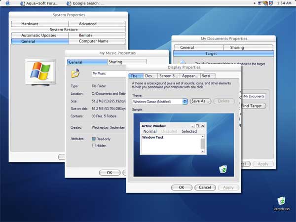
First off, regarding your inquiry on whether or not the tabs are stretched in your themes, some do appear to be stretched (ie My computer properties), some appear to be fine (eg Display) and some appear to be somewhat in the middle (ie My Music properties etc.). I don't know if this is with all WB themes or just yours, since I have only checked yours though.

The only two things I don't like in the theme (which prevent me from giving it a 9.5 or a perfect 10) are:

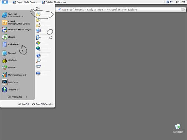
1. The Start Menu (See Attachment)

-(1) I don't really like the grey. The contrast is kind of odd in comparison to the lighter grey. Perhaps something a little more textured (like the OS X stripes) would work better?

-(2) It's not really possible to see the font on the My Computer, My Documents, etc because it's white, and the background is light grey. A black color or some sort of dark grey might work better

-(3) The start menu is cut short as you can see, which makes some words cut off, and makes the start menu look awkward overall. Perhaps I'm just using smaller icons than I should be? How would you recommend I go about fixing it?

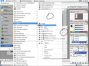
2. The Right Click Menu and other menus (See Attachment in next message)

- Again, my only dislike here is a lack of texture, which makes it look too much like WinXP, and not enough like Mac. Maybe a sort of striped Mac background would be better here too?

That's pretty much it. I could be nitpicky and ask you to use the same image on the Start menu rollovers as you do on the right click rollovers (which are awesome), but that's maybe me being a stickler.

All in all though, a fantastic theme... with those two enhancments though, it would probably be a perfect 10!

post-19923-1097550214_thumb.jpg

Bz1.jpg
Bz1.jpg

#220294

Image 2 (for the above post)

post-19923-1097550481_thumb.png

Bz2.gif
Bz2.gif

#220296

@ unionjack, Im glad you like the theme. as for your suggestions:

1. Yeah the contrast is a little wierd.. I might change it but probably not...

2 and 3 The start panel was designed to be compact with my big 96 size icons... I will probably change this to a normal size start menu and change the text color.

2 (right click menu) Right click menu was taken directly from the mac theme... so it wont be changed.

Thanks for downloading! Oh and if you could post a few screenshots of the tabs that would be great.. Is anyone else getting tab problems with 4.4?

#220305

hey, actually, you're right. i realized they just looked weird because i had extra high transparency on. now that it's off, it looks really good. coming back now to it, i decreased the number of icons on my start menu and it looks fine, so contrast isnt a big issue either. I would like to know how to increase the icon size of the icons of the right though. if you could tell me how, i'd greatly appreciate it. i've seen it around and i really like the look of it. as well, do you know how to decrease the number of icons of the right hand side as well? i have some there that could be removed.

and sure! i'll try taking some pics right now

#220310

here ya go bz :)

same as what you have?

post-19923-1097557084_thumb.jpg

tabs.jpg
tabs.jpg

#220312

Well... I figured out the tab problem... and unfortunatlely it is in every one of my skins. For some reason 4.3 and 4.4 apply system fonts differently. In my skins the only ssytem font that I supply is the system menu font so taht windows knows to make menus big enough for the larger lucida font taht I used in system menus. For some reason... in this version of windowlbinds... the system menu font is being applied to some tabs also making them much bigger than they should be. I am looking for a solution :(

edit... actually I have only sort of figured it out... they are still streteched for some reason. hmm

#220314

btw bz, i have a question about the prefs themes. i noticed in your pics that only some windows have the prefs but not all do. how can i remove the prefs from certain windows and programs (like internet explorer, etc)? also, is there a way that i can move the prefs to be underneath the file/edit/etc buttons and not above? thanks again :)

#220315

prefs should be used ONLY for per application skinning in windowlbinds. THey should be used for wbconfig.exe, wfload.exe (if you use windowfx) and rundll32.exe

check some of my other threads for insrtuctions on how to set per application skins.

#220317

Great! works like a charm now :) thanks!

i dont actually mind the expanded tabs though. they dont really bother me particularly and i doubt many others are too concerned with it either. I actually wouldn't have noticed it had you not mentioned it.

btw, would you be able to tell me how to increase the icon size of the icons of the right side of the start menu? i'd really appreciate it if you did. as well, do you know how to decrease the number of icons of the right hand side as well? i have some there that could be removed.

thanks again.

#220321