Aqua-Soft Forums
Buttons I just fixed, i added active states to them so it gives you more of the aqua feel.
Post count removed same with reputation.
Buttons I just fixed, i added active states to them so it gives you more of the aqua feel.
Post count removed same with reputation.
there is no reputation crap on the userbit info, i removed it
after resetting my cache, too --> clickety click!
lol, we are talking about the new skin buddy 
Nice, but mebe use aquafied MSN/AIM icons 
I think it's looking quite good. I would try to customize it further though. More css for instance; on buttons (like the post quick reply button) where you could use a more aqua based background on the button, text input fields could have a thin thin gradient to make it feel more 'aquatic'. MSN/AIM icons should be using the apple icons.
all of the buttons that I see have the aqua buttons :S
Yeah the buttons in your postbit does, but I mean the input buttons (like in newthread and newreply, you have 'submit reply', 'preview post'. Ok it's a small thing, but I think it would be nice if you use a css class for it with a nice aqua glossy css background.all of the buttons that I see have the aqua buttons :S
Also, in the editor (the one I'm writing in now in newreply), it would be nice if you could change the background. Now it's got that default beige color. And what about adding a aqua background to the 'bold', 'italics' buttons in the editor. It's easy and would look fantastic. Having a nice editor interface will encourage people to post more
I'd also recommend changing the post icons too. Default isn't too nice.
Your work is great mate, I just don't like to see default vbulletin stuff into a nice interface. It doesn't work well..
uhoh timmeh. wide threads are ugly: http://patrickyan.net/ul/skinbugalug.png
Zacharius, i think you should refresh your cache, there are no default icons anymore :confused:
I do agree with the message editor box tough..
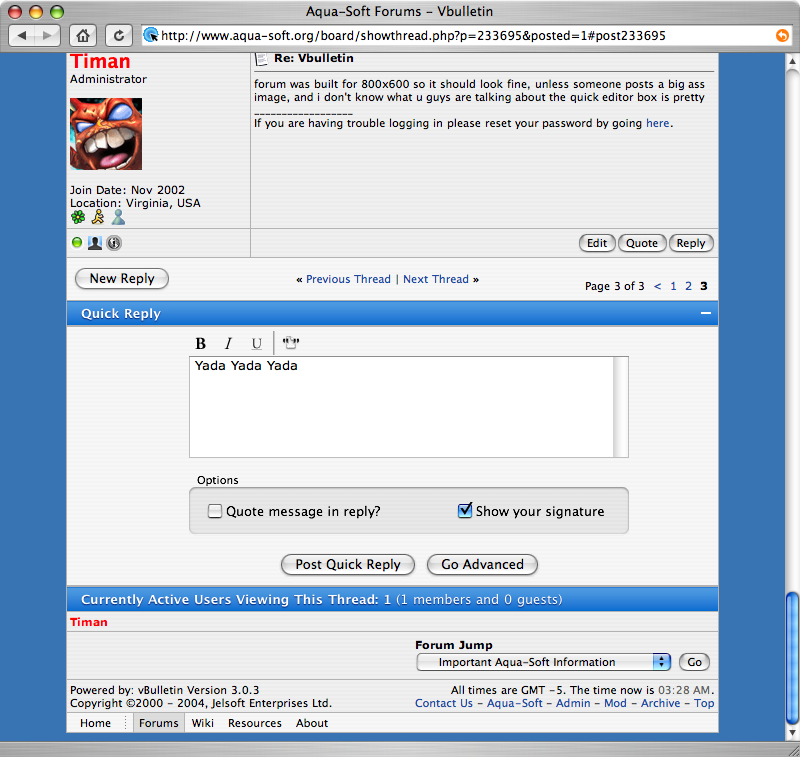
forum was built for 800x600 so it should look fine, unless someone posts a big ass image, and i don't know what u guys are talking about the quick editor box is pretty
I just refreshed my cache in Firefox and the defualt AIM/MSN icons are there still.
Also, the Quick reply box looks the same.
Ok, I lied with lovely photoshop and apples interface builder, anyway you guys need to send me feedback i want it all EVERYTHING! unsanity@NOSPAMMORZcox.net <-msn
Well, the annoucements part should get the interface style your using.
Also, a rules link should be at the top of each page.
Tim, my quick reply box is not like yours even after cache was flushed.
Maybe because Timan said he photoshop'ed itTim, my quick reply box is not like yours even after cache was flushed.
He said "my quick editor box is pretty"
Never trust what Timan says... 
Tim always tells the honest truth, seph is the one that lies and does photoshop mockups
LOL :confused:
uhoh :confused: