My New Business Web Site I Create!

hi to all

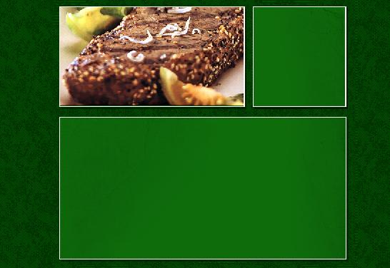
I create the website for my uncle's business he asked me to do, So what do you think?

delete

PS: I have a problem with the contact us page, when I fill the form and click send it will popup window ask me "this form is being submitted using e-mail. you may continue or cancel this submission."

what can I do to avoid this message?

#217593

Too many images. It takes too long to load. The design itself looks good, but I am sure you can find a way to knock down the size and make it look similar.

#217594

thanks alot wizard for your reply, I know that but the size of the imags not to big, all the site size is 3.85mb

just the (main page and about us) it take more time to load but the rest of the pages will load fast.

#217595

The main page trys to add itself to my favorites- NOT a good idea. If people want to add it to their favorites, they'll do so. Too reminiscent of a popup, and just plain annoying.

I agree with wizard about the images- I know you say it loads quickly after the main page, but still, see if you can either reduce the size, or stop using images for every part. On the main page, the lower content, you can remove a lot of images- use CSS and text together to achieve the same thing.

Make the search button stand out more. Maybe a different color (on non-Home pages).

If I see more later, I'll tell you (Lunch is calling :D )

On the whole, pretty nice.

-nightcrawler1089

#217597

thanks for the advice nightcrawler1089, About the popup window my uncle want me to add it to his page because He say that when people come and visit his site and live the will forget what the site address! I now that is not good idea, but what can I do! I just fallow the orders that what he want:D. about the search I will change it soon but still thinking what do I need to do with the space.

#217600

You are the web designer- treat your uncle like a customer and tell him that it might turn people away from the site. If he still wants a way so that people can remember it, have a link somewhere in the upper part of the main page that says "Add this page to Favorites" or, make it bookmarks (depends on your target audience- what browser do they use?). Then, just link that to the code that pops up the Favorites Window.

Lunch is done, but I'm busy now...I'll keep looking later.

-nightcrawler1089

#217607

I'd written a nice long reply, but then I clicked on the search field on your site, and it crashed my copy of Firefox (0.9.1) - I'm not writing it all again :P

You might want to have a look at that problem - Firefox is becoming more and more widely used

#217608

nightcrawler1089, I will try to do that.

@dappleyard sorry for your crash, about the searsh in the main page just Image it will take you to the search page.

#217610

I would seriously recommend scrapping the bulk of what you've got and starting again, in terms of implementation.

The design isn't all too bad, but making it completely from images?

Yeuch.

One reason for not using 100% images for the site is that the homepage weighs roughly 300KiB. This would take roughly 2 minutes on a perfect dial-up connection, but no such thing exists, so we can safely say that the page will take an average of about 3 or more minutes to load. No user will wait that long. They'll press the back button before the frankly intelligence-insulting "add to favourites" (which only works in IE, for what it's worth) even gets to pop up. So, although a fair portion of the images will get cached by the browser, "real" users will never have them cached, because they'll leave before they've loaded.

Much as broadband is very popular, you can't take it for granted that the site's viewers will have broadband access.

What about users who have limited or no vision? They can't resize your images like they could for text (poor vision), or have their audio-browser read your homepage content to them.

With regards to the add to favourites pop-up, if they don't know how to save a favourite, they very likely don't know how to load one, so popping up a dialog asking them to save one will just confuse them anyway, so why bother?

With regards to the homepage search - you shouldn't have an image that looks like a textbox that's actually a link - this just confuses users (hell, it confused me, and I'm a professional web developer). Either have a textbox or a link, not one pretending to be another.

#217612

I'm on a 1meg connection and its still loading - 2 minutes later!

use css and drop all the images - or at the very least have one huge jpg image.

#217613

Originally posted by Stevie BM@Sep 29 2004, 05:47 PM

I would seriously recommend scrapping the bulk of what you've got and starting again, in terms of implementation.

The design isn't all too bad, but making it completely from images?

Yeuch.

One reason for not using 100% images for the site is that the homepage weighs roughly 300KiB. This would take roughly 2 minutes on a perfect dial-up connection, but no such thing exists, so we can safely say that the page will take an average of about 3 or more minutes to load. No user will wait that long. They'll press the back button before the frankly intelligence-insulting "add to favourites" (which only works in IE, for what it's worth) even gets to pop up. So, although a fair portion of the images will get cached by the browser, "real" users will never have them cached, because they'll leave before they've loaded.

thanks alot Stevie BM for your nice ditales I will do my best ot take car of this thing. but right now I have calc to study ;)

#217614

Ähm: First The page doesnt hase the yummie yummie effect.... and u wanna sell food... MY OPINION...

and the search field as a button thing???? Why dont u use a real form???

#217622

we don't sale as grocery store! my uncle sale his meat to dealers.

#217625

I understand you're still a beginner, but...

Change the scroll bars back, or at least, change one of the colors so we can see where we are on the page.

Make the "ZemZem does not compromise..." at the top of the page stand out more. It just look somewhat weird all there by itself. Maybe put it in a box a certain type of border, or a different font/color, or something. You get the idea...

Yeah, agree with Stevie about the Search, and everything else he says. I'm on broadband, so image loading isn't too much of a problem for me, but he's definitely right, especially for all those with dial-up.

Keep working!

-nightcrawler1089

#217632

again thanks nightcrawler1089 for the awesome tip I'll do my best :D but now my classes come first ;D. when I have extra time I'll fix it!.

see ya all. I will be around...

PS: my uncle still using dial-up connection at home. he told me that he one the site in loss then 30sic :blink:. any way I will try my best.

#217638

the navigation doesn't stand out. it is the same green as the rest of the website, and it took a while for me to realize that was a nav. also, it is annoying when i am on a 1.5m connection, that i take 2-3 seconds to load anything. having so many images for one thing is not so great, and images for text?

as stevie has said sometime before. use images for images, and text for text.

#217906

PS: my uncle still using dial-up connection at home. he told me that he one the site in loss then 30sic :blink:. any way I will try my best.

That is too long for most people. You want a page to load in < 10 seconds on 56k for preference.

#217924

I have just finish the new style it's good and loss image :D, I love to show you guys.

all what I need right now some Fonts can go with this site! I want Digital fonts so I can type in small size but you still see it...

post-20298-1096699216_thumb.jpg

untitled.JPG
untitled.JPG

#218295

I have just finish the new style it's good and loss image :D, I love to show you guys.

all what I need right now some Fonts can go with this site! I want Digital fonts so I can type in small size but you still see it...

The design itself wasn't the problem - it was the way you had created it.

Also, why in the nine hells have you created a new account?

Didn't you read the homepage?

PM Tim or myself, so that we can merge your two accounts :slant:

#218325