
[wip] Maha.stuff

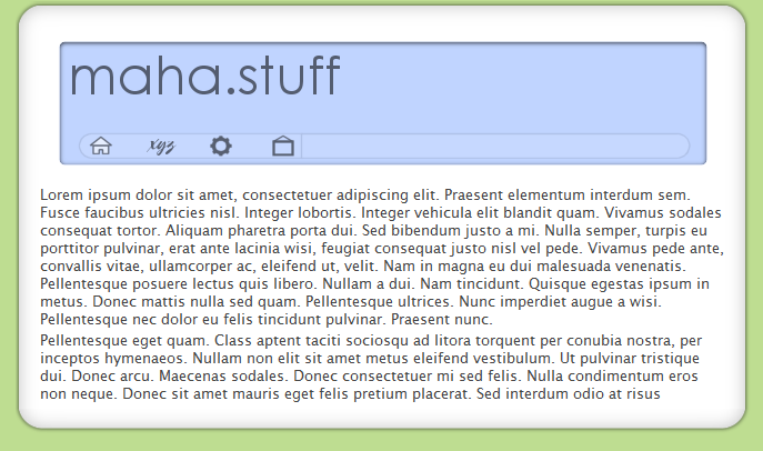
Been working on this for a few days now.. I'd like some comments/suggestions on the design. The thing along the bottom of the "screen" is a navbar; the long bit next to the icons will show descriptive text on mouseover. To me, the top-right corner looks empty, but I have no idea what to put there.

Edit - demo
post-17262-1093205029_thumb.png

preview.png
preview.png

#205770

It's easy on the eyes, I like it. Except for the fact I can't understand a single word in the paragraph (:P)

Nothing comes to my mind for what you could add in the corner, but if anything enters, I will try not to lose it.

Maybe a small animation of something like the rings in your avatar circling each other, but have a digital look.

#205775

your content sucks, but it is a very good design :)

#205779

Originally posted by wizard+Aug 22 2004, 04:13 PM-->
QUOTE(wizard @ Aug 22 2004, 04:13 PM)
It's easy on the eyes, I like it. Except for the fact I can't understand a single word in the paragraph (:P)

Nothing comes to my mind for what you could add in the corner, but if anything enters, I will try not to lose it.

Maybe a small animation of something like the rings in your avatar circling each other, but have a digital look.

<{POST_SNAPBACK}>

I like the idea of a digitalized logo thing.. thanks ;)

#205787

It's nice. But I can't think what you could do with that top right bit. Maybe if you use a host with ads they could go there?

#205871

Kicks ass :) But i cant understand the Latin (I think thats what it is ?)

verry well :)

#206049

...has no one heard of Lorem Ipsum?? Geez, its randomn text with randomn letters generated from a generator.

#206141

Links Please :P

#206229

I learn latin at school, and it's horrible to translate it.

(especially for the case latin -> english, for me it would be latin-->german-->english - but that only BTW)

other way: I like this text :P - It better then simplky fil your page with a tiled "text" :)

EDIT:

And: it is definitly no a GENERATED text. -> see the website.

#206290