[wip] Softsnow Vs

EDIT: Sorry, project cancelled.

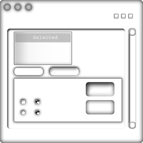
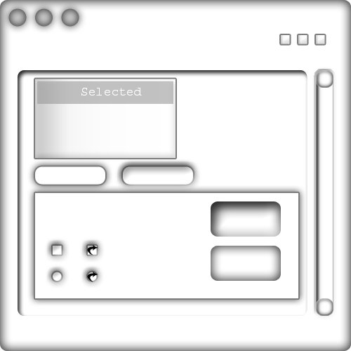
I'm gonna do a VS of my own (eventually), and to save any wasted effort, and as i don't have that much time on my hands, wondered what all you knowledgeable people think of the preview style pictured below. I also have several other styles, so i will post those to and hopefully you can tell me which one i should make!

Thanks alot,

PREVIEW PIC No. 1:
post-10132-1087054969_thumb.jpg

SoftSnowPrev.jpg
SoftSnowPrev.jpg

#175947

IMO, the shadows really bring down this theme. Try not to have them coming from the top as much... The bottom shaodw looks nice, but I don't care too much for the Top ones.

#175951

Originally posted by XJOSHATTACKX@Jun 12 2004, 10:57 AM

IMO, the shadows really bring down this theme. Try not to have them coming from the top as much... The bottom shaodw looks nice, but I don't care too much for the Top ones.

:yes: the shadows make it look a bit untidy, but yeah, that is jut my humble opinion.

On another topic, the tag [prev/quest] doesnt exist. I understand what you tried to say, you wanted to preview it and at the same time request some views. The [WIP] tag implies that you are working on something, showing a preview of it (while is isnt finished) and the comments and views are implicit, wouldnt you agree? ;)

---------------------

The Topic Has Been Re-Tagged

// Seph

#175955

Maybe this should go in a different forum too, Seph?

// Lou

#175968

Originally posted by Lou@Jun 12 2004, 12:05 PM

Maybe this should go in a different forum too, Seph?

// Lou

Damn, didnt see that...

Thanks for the heads up, Lou.

-------------------------

This is not General Discussion. This is GUI Customization.

The Topic Has Been Moved

// Seph

#175970

Originally posted by Seph@Jun 12 2004, 12:06 PM

Damn, didnt see that...

Thanks for the heads up, Lou.

-------------------------

This is not General Discussion. This is GUI Customization.

The Topic Has Been Moved

// Seph

Oh, no problem, Seph. *Always looking out*

// Lou

#175973

looks like i'm not very good at topic placement, hmmmm..... guess i'll have to work on it..... cheers anyway seph.

#175981

yeh, the inner shadows take away, and also maybe clean up the buttens, they seem a little choppy on the edges

#176007

Not bad. Nice what the others advised, it would look better without the shadows. :)

#176194

:puke:

.. sorry the over usage of shadows really brings this theme down, and im not sure if your preview is to scale.. but it looks so bloated, no?

#176207

The idea is a good one. I'm all for shadows, but there can be too much of a good thing. ;)

My only real suggestion would be to turn down the shadows a bit. Keep it all clean.

Hope this doesn't offend you or anything. I figured it would be better to show my suggestion. Click here for a bigger version.

#176416

no, that's cool, yeah it is a bit oversized, i've got a different style to post as well which i'll put up, i don't really think that was one of my better efforts! cheers for the feedback everyone. (and that looks good to me sketching :) i don't offend that easily lol)

#176420

Cool, you never know about some people. :lol:

I'm looking forward to seeing what else you got in your head. It's always good to see other people trying out VS ideas. You're braver than I.

Good luck.

#176423