 Aqua-Soft Forums
[wip] Suggestions Please
im gonna be completely honest
date/time - completely unneeded
heat index, wind, wind dir., and humidity.... also must go.
basically... take the temp, and condition and icon for condition, put it where u have the time, then make the map the same width as the one on top, try n make it like 25% smaller
im retarded.... hahahaha, yah, the one in the link... looks pretty good
:banging: :bummer: :pchawk:
Tags go the other way around  I have tagged your thread.
-------------------
The Topic Has Been Tagged
// Seph
Lookin' good.
looks great 
try to change the alpha blending of the text box to itegrate these better in the background.(or make labels?)
I do like the Meter images on your config. Are they part of the background or seperate images? If they are seperate images, where can I find them?
Otherwise, looks good. A bit cluttered IMO, but i'm a minimalist at heart.
TYT
Haha! I started to write my opinions on the same one tide was looking at. It's confusing 
It looks nice, but I kind of find it odd that the Monitors and Email/Web buttons are so spaced out, that when you get to the weather and news headlines, they look like they are squished together to make them fit. Maybe, you could scale down the meter sizes and something else that I can't get my hand on to make the bottom look less cluttered.
Thanks for the input, still hacking away it 
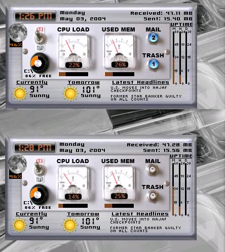
While it is very cool looking, it is very "busy". I would not use it because when i want to get information, i want to get it easily. Not look around for it. I would suggest you take out some of the "busyness", maybe simplify it a little.
Looks great Kevin!! :woot: