Aqua-Soft Forums
Now available
Issues off the top of my head
1. mail icon
2. text in search field
3. bookmark toolbar
4. small icons not fully supported yet
Now available
Issues off the top of my head
1. mail icon
2. text in search field
3. bookmark toolbar
4. small icons not fully supported yet
Originally posted by Pe7er@Apr 12 2004, 12:49 PMTopic title edited.
It is a release, as I assume
-Pe7er
It's at my site now.
I know, I added this tag just to help newsposters 
I've downloaded it, I've tried, umm... I LIKE IT!!! AWSOME WORK!! keep up your wonderful work dude! :rule: (Y)
For anyone who has tried this: bold or normal font for tabs and pinstripe on statusbar too?
perhaps a preview lynch?
I would say normal font for tabs. Looks better that way. Very nice btw.
^^ now that's a little more like it
fonts look good in that shot by the way exept they look a little squeezed together in the title bar of the main window, perhaps due to the bold type.
That's an old screenshot.
Issues off the top of my head
1. mail icon
**fixed compression issue
2. text in search field
3. bookmark toolbar
4. small icons not fully supported yet
someone else want to explain and maybe give him the font - I'm tired of it.
not sure about the font thing, but i know that definitely font SIZE per-say is affected by the current visual style you are using. If you WB, i have no idea as I don't use WB.
Wow good stuff so far Lynch...the colorful icons are really nice.
Originally posted by Mav451@Apr 13 2004, 03:39 AMnot sure about the font thing, but i know that definitely font SIZE per-say is affected by the current visual style you are using. If you WB, i have no idea as I don't use WB.
I m using styleXP, not WB.
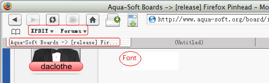
and the same VS, the font of other skin desplay is good.
look at image.


lol, as theme genie would be proud of moi, as I really liked the look of the tab text being 'normal-font weight' on both the active & inactive tabs...
So I wanted this look also for GotMilk, and extracted both tabbox.css from my profile:
global\tabbox.css...after making a comparative analysis of the two for about 45 minutes, they seemed exactly identical with the following exception:
In Pinhead tabbox.css was this line:
background-image: url('F.png') !important;
In GotMilk tabbox.css was this line:
background-color: #F5F5F5;
So even after replacing 'all instances' of font weight from 'bold' to 'normal' throughout the entire tabbox.css, the active tab on GotMilk, was still showing 'bold'-font weight...
I then used the tabbox.css from Pinhead, and replaced the one line of code above in Pinhead, with the line of code from the tabbox.css of GotMilk...lol!
Final results: I now have GotMilk to show 'normal-font weight' in both its active & inactive tabs...
:woot:  :rock:
Great theme but ive got a sligh prob. The address bar doesnt quite fit the way it should do maybe its my high screen res ?? 1600 x 1200. Ive attached a screenshot of both hover and normal states. Any ideas ? I also dont seem to get the bookmark icon to show up but u did say u had issues to sort with that.


I've only got 1024 res. Use a flexible space as a temp fix.
poste removed by kenzo